
Features

The toolkit that eliminates the overhead.

Everything you need to stop switching between chatbot, terminal, and image editors. In one place.

Merge, trim, clean, and import data seamlessly.

Use native import to parse headers and merge multiple files, or
use the assistant's file-operations mode to programmatically trim, splice, and manipulate - all the versatility of Python.

Native import

Drag in files, fix the parse, and merge them into one project - structured and reproducible, with no code to write.

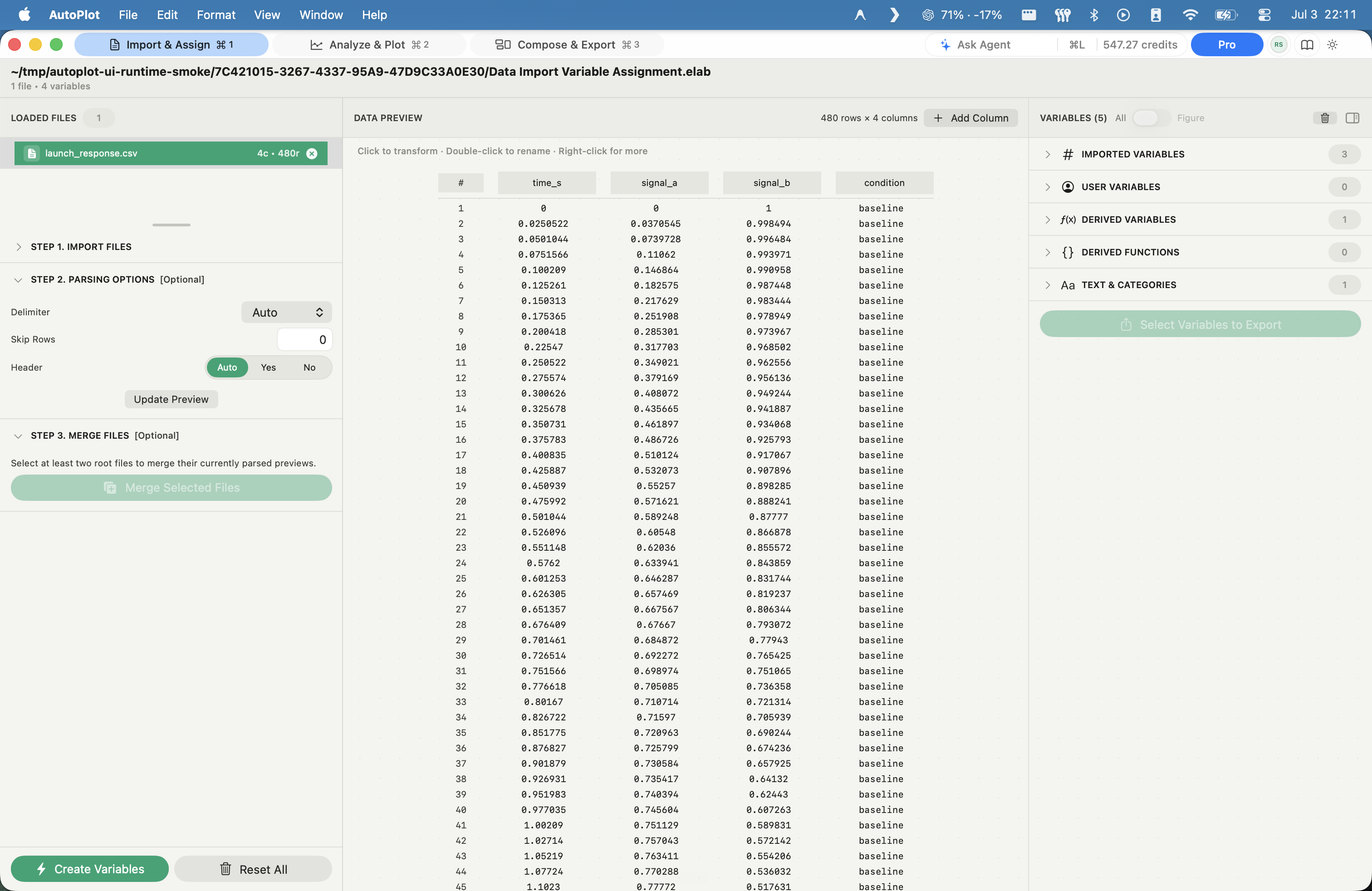
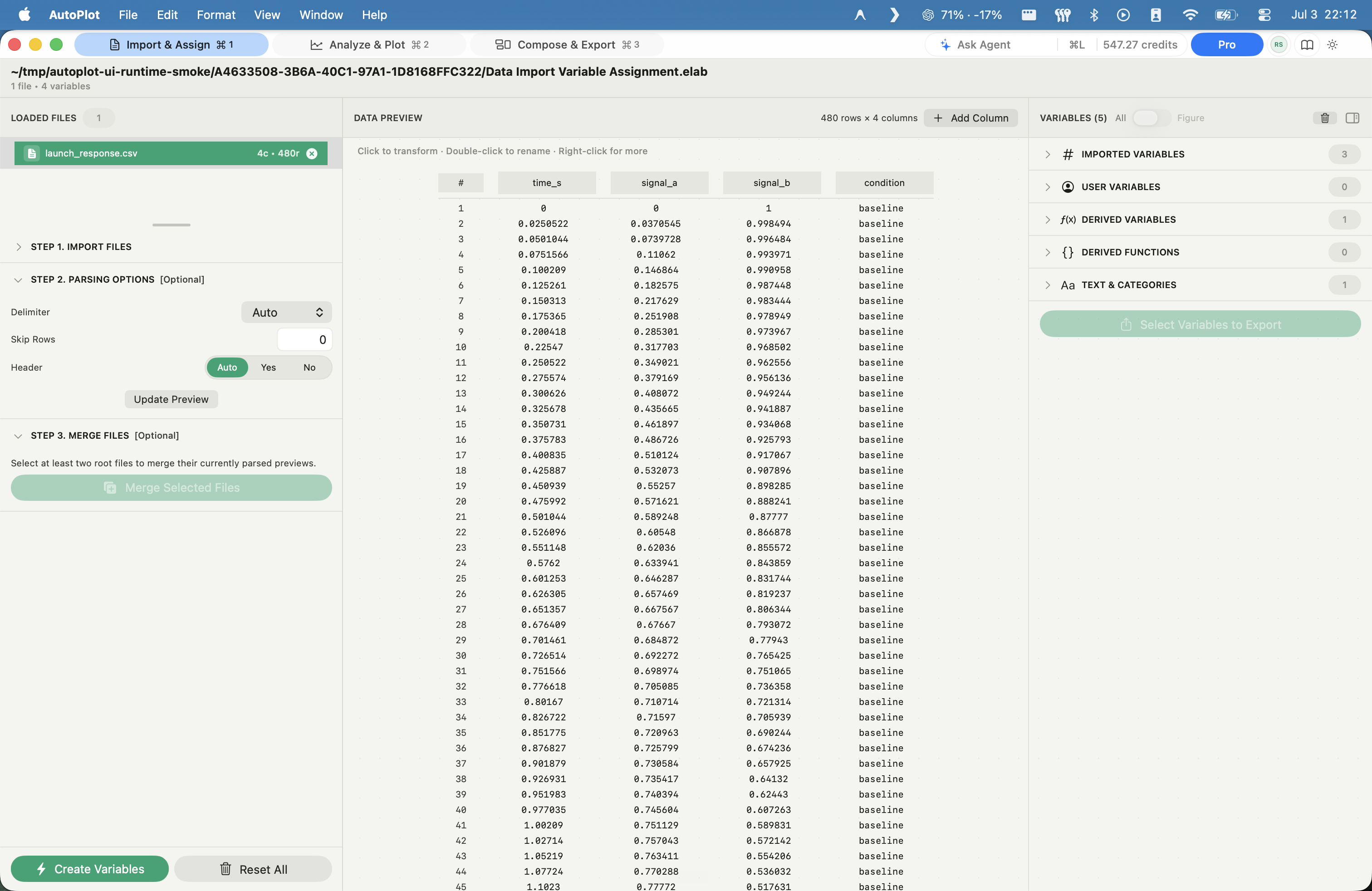
AutoPlot Import & parse screenshot

Import & parse

Import messy files with a checked preview before anything becomes data.

In
CSV, TSV, or delimited text - one file or a batch
Method
Drag and drop; parser controls for delimiter, header row, skipped rows, and encoding; a live preview table before commit
Out
Parsed source columns, held inside the project
AutoPlot Variables & derived data screenshot

Variables & derived data

Turn columns into durable variables every plot, fit, and workspace can reuse.

In
Parsed columns
Method
Name columns as variables; derive, filter, and split; batch-create across many files
Out
A reusable variable vocabulary every card can reference

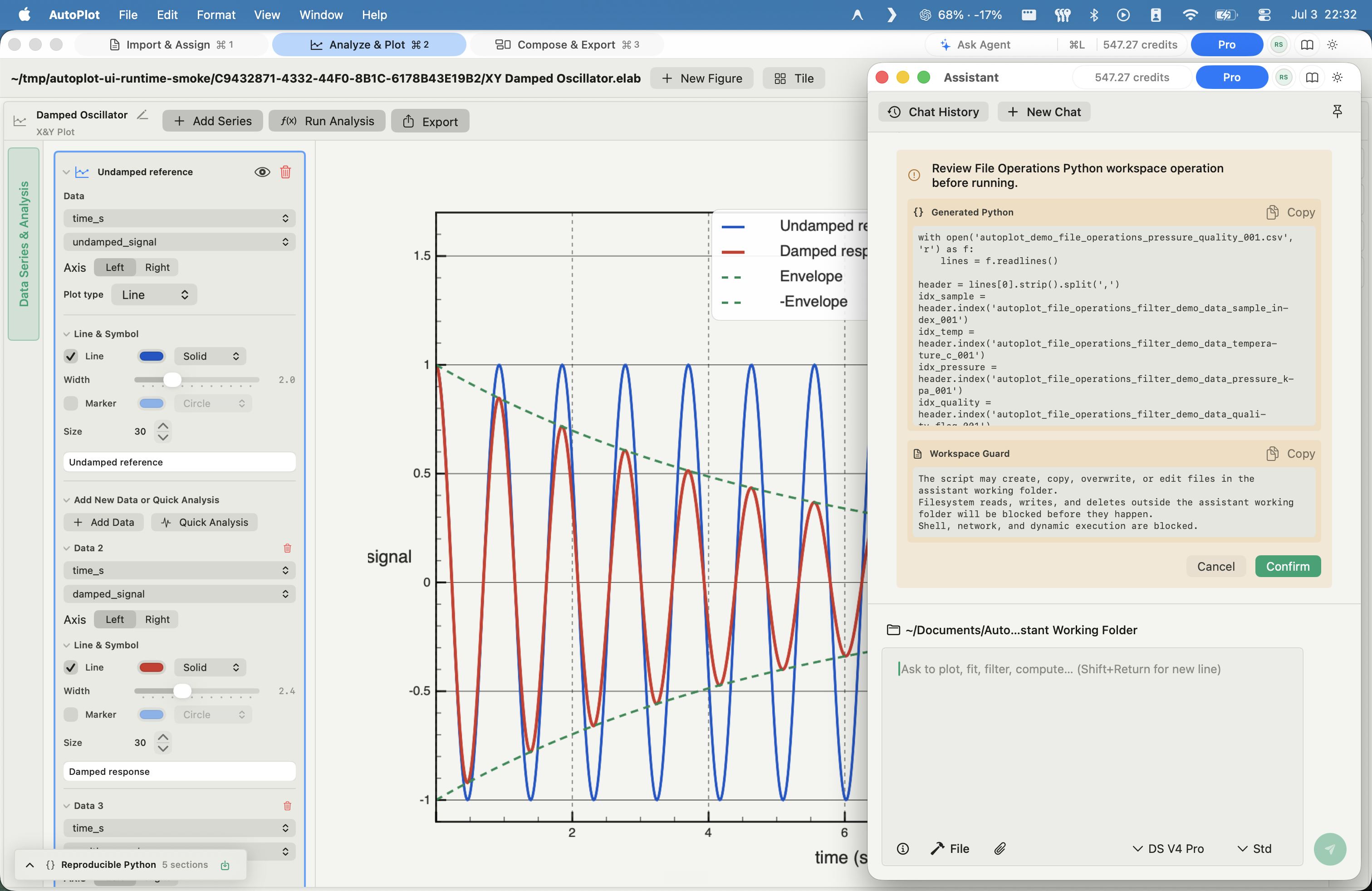
Assistant file operations

When you need real data surgery, describe it and the assistant writes Python code - you read and approve every line before it runs, and your raw values never leave the Mac.

AutoPlot Assistant data wrangling screenshot

Assistant data wrangling

Clean and reshape data with approved Python code, without uploading raw values.

In
Your files and variables, plus a plain-language request
Method
The assistant writes Python/NumPy to merge files, filter and trim rows, slice and split variables, merge columns across files, and clean or impute - shown as a Python preview you approve before it runs
Out
Cleaned, reshaped variables, with the script saved for reproducibility

Visualize 2D and 3D data

Plot 2D data as X&Y scatters, lines, and histograms; plot 3D data flat as a heat map or in a true 3D scene - surface, scatter, or line. Every figure overlays as many data series and analysis results as you want.

2D data

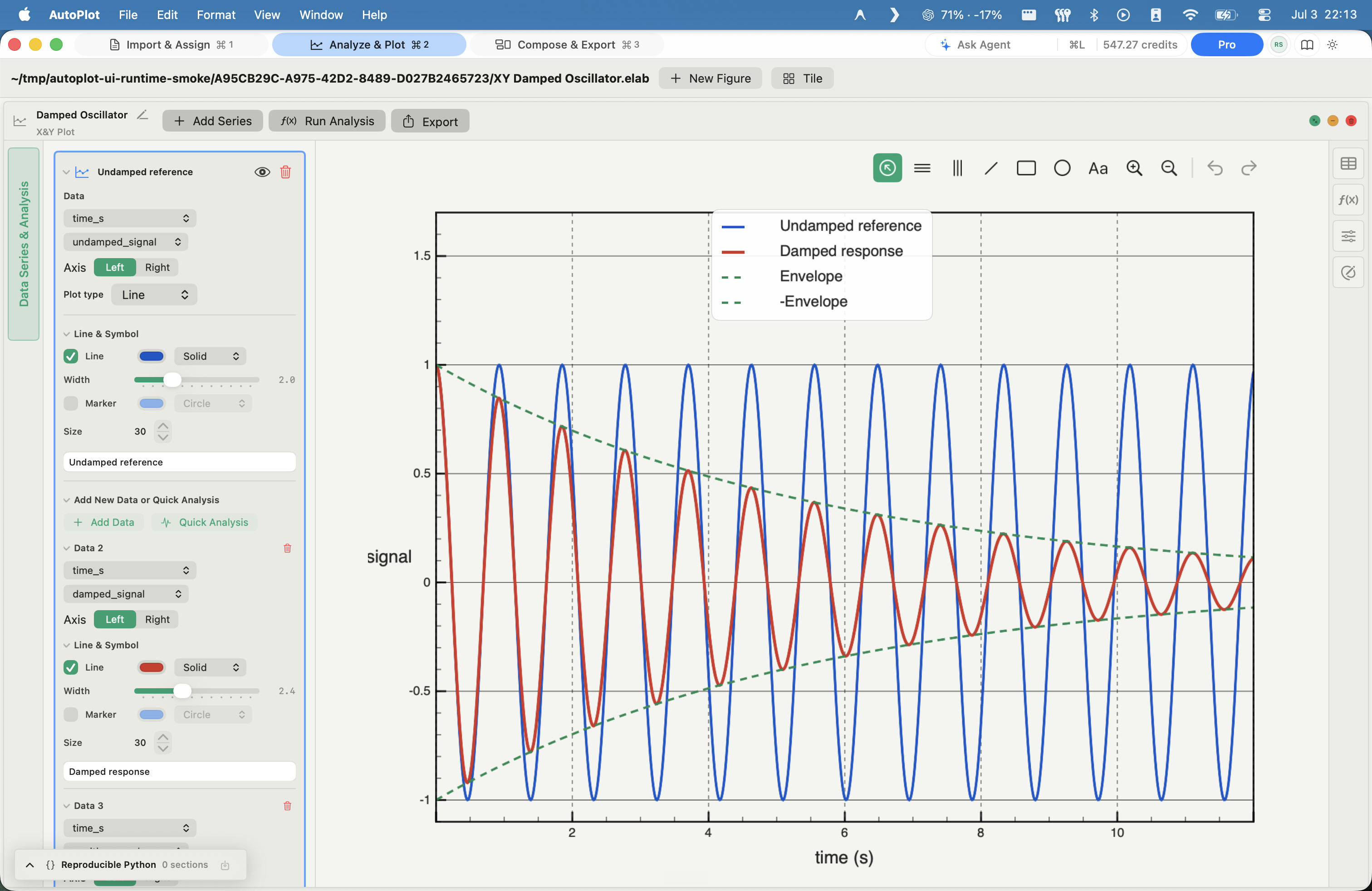
AutoPlot X&Y plot screenshot

X&Y plot

Free

Overlay series, fits, summaries, and dual axes in the core figure.

In
Paired x and y columns (x optional - defaults to row index)
Method
Linear or log axes; series styles line, step, bars, stem, lollipop, area, ribbon; dual axis; in-card error bars, running averages, smoothing, linear and polynomial trends, ensemble summaries
Out
A multi-series figure that overlays any data and analysis outputs
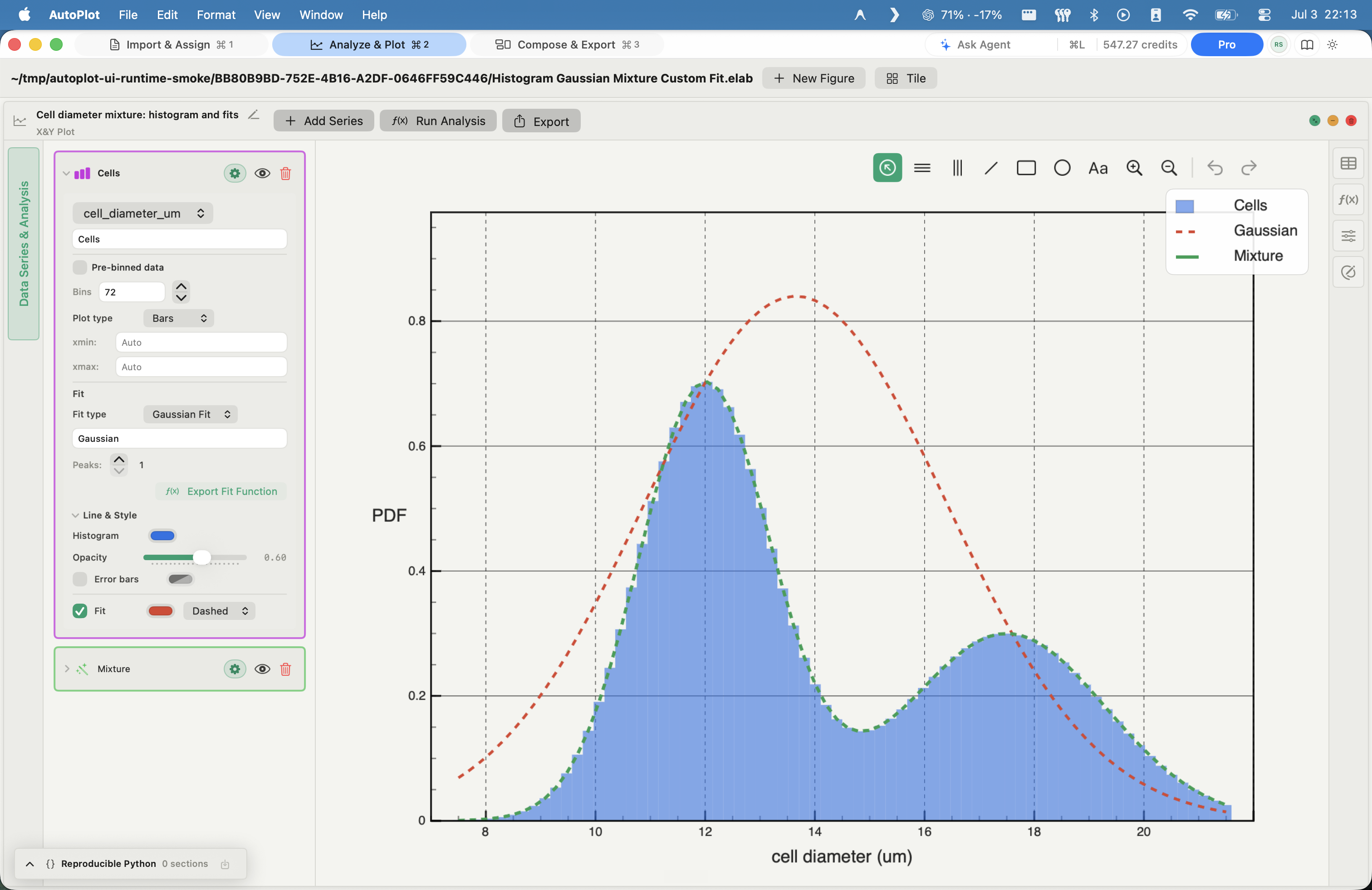
AutoPlot Histogram screenshot

Histogram

Free

See distribution shape fast, with density bins and optional fits.

In
One numeric variable
Method
Density-normalized histogram; bars, steps, line, or scatter; overlay a Gaussian-mixture or custom fit
Out
A distribution figure, fit overlaid

3D data - flat or in 3D

The same x, y, z, shown as a flat color map or in a real 3D scene.

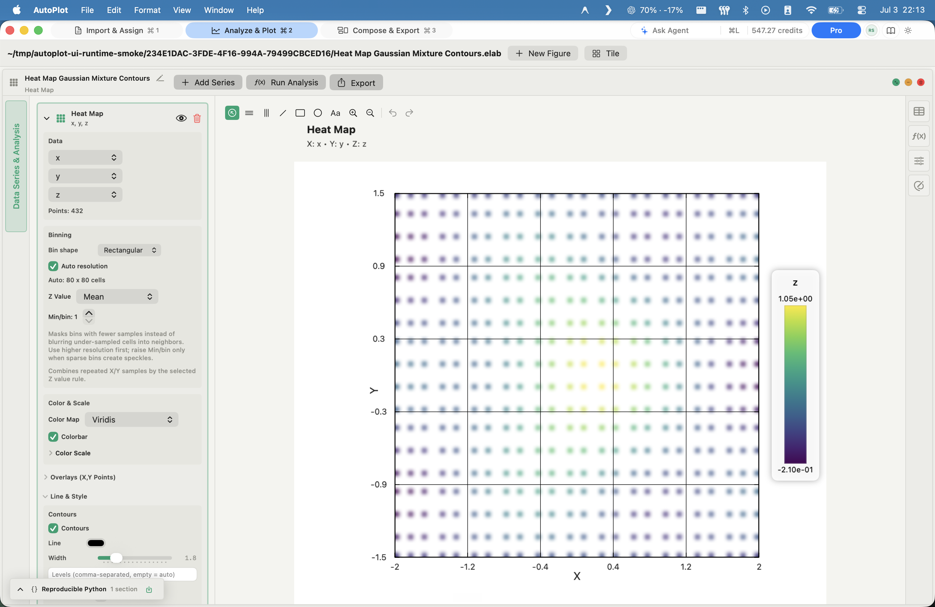
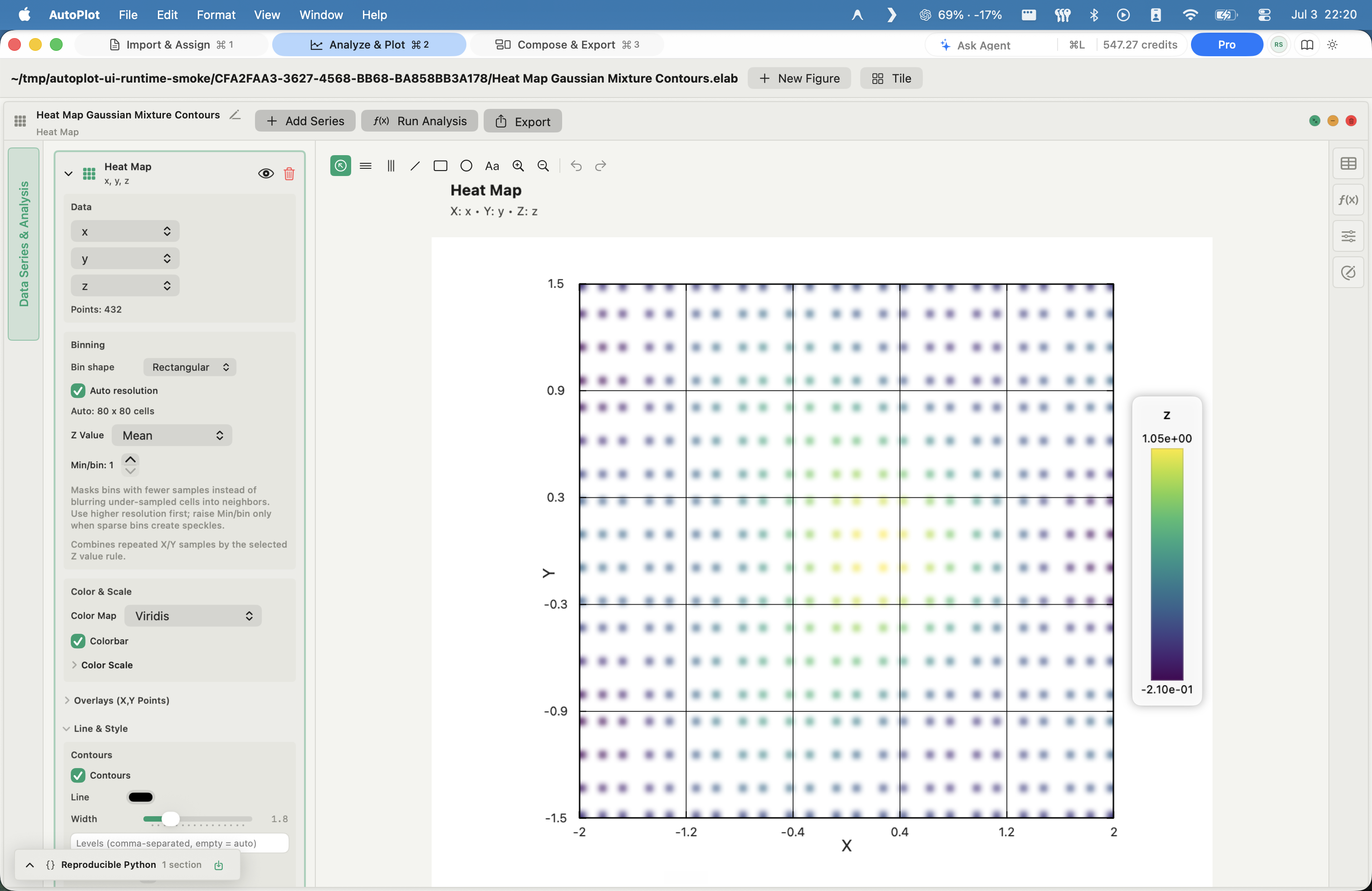
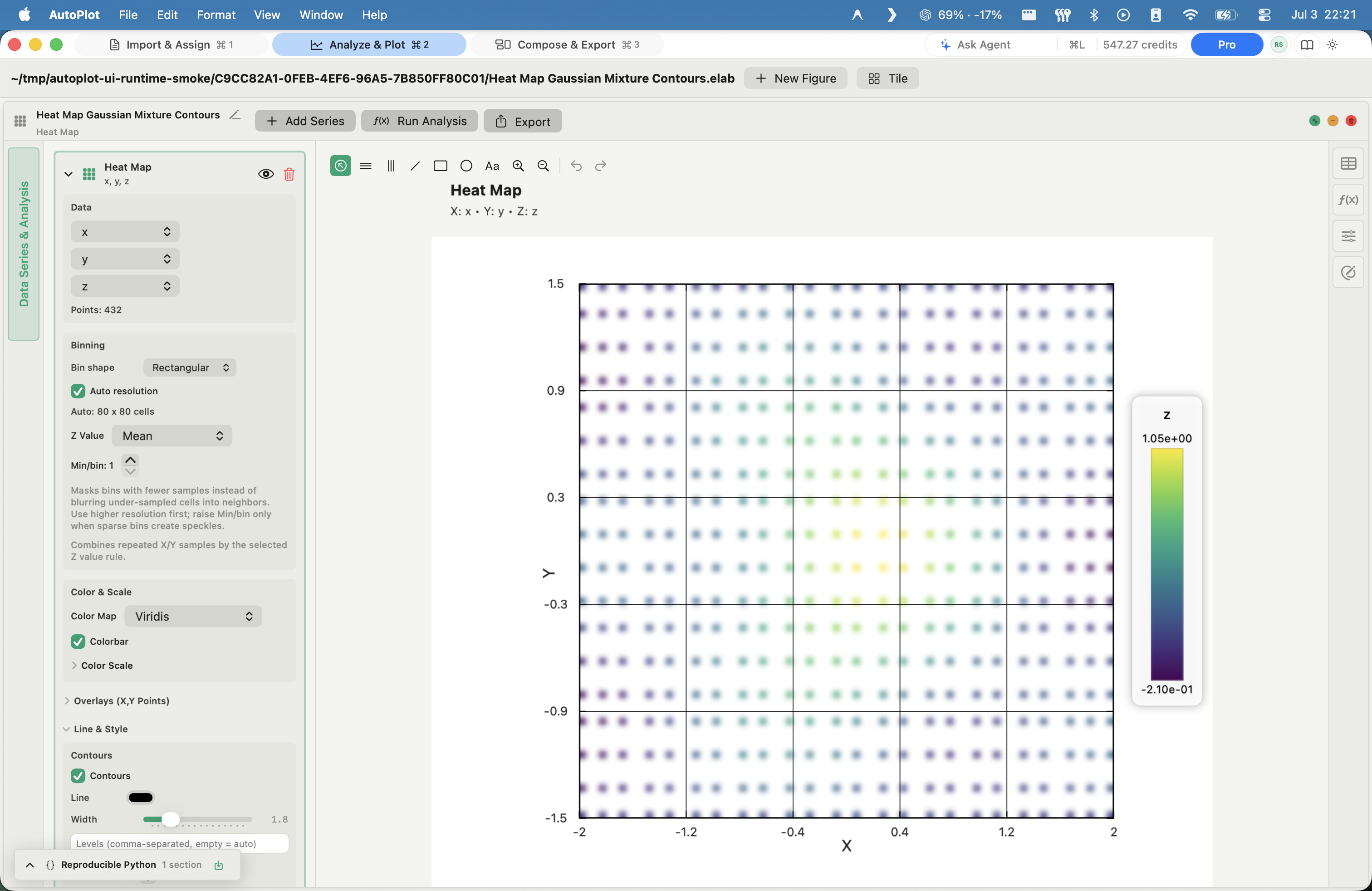
AutoPlot Heat map screenshot

Heat map

Plus

Turn x, y, z into a readable scalar field with contours.

In
Numeric x, y, z
Method
2D binning into rectangular or hex cells; aggregation by mean, median, sum, min, max, std dev, or count; color scale, smoothing, contours, raw-point overlays
Out
A scalar-field map with colorbar and optional contours
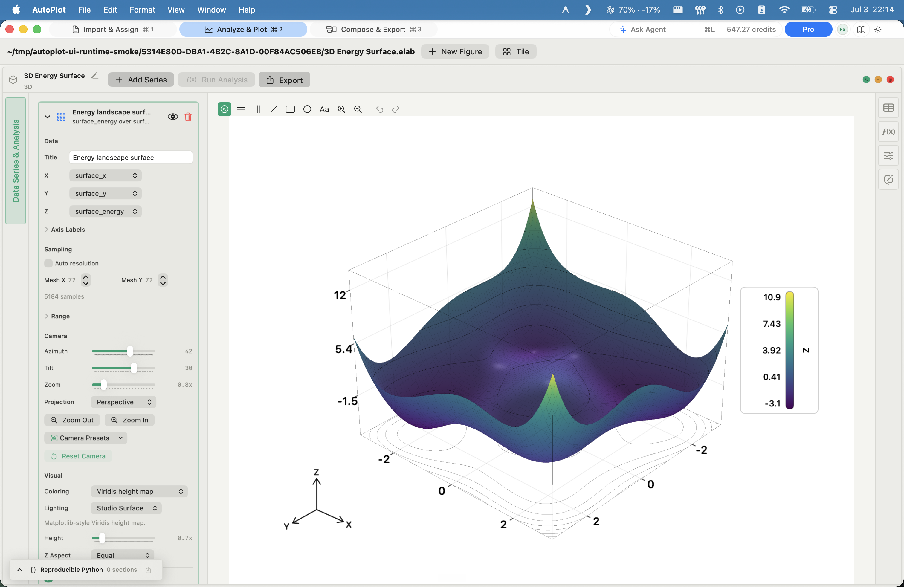
AutoPlot 3D surface plot screenshot

3D surface plot

Plus

Read height fields in a rotatable, export-ready 3D surface.

In
Gridded x, y, z
Method
Lit, triangulated surface; height colormap; camera azimuth/tilt; perspective or orthographic projection
Out
An interactive, export-ready 3D surface
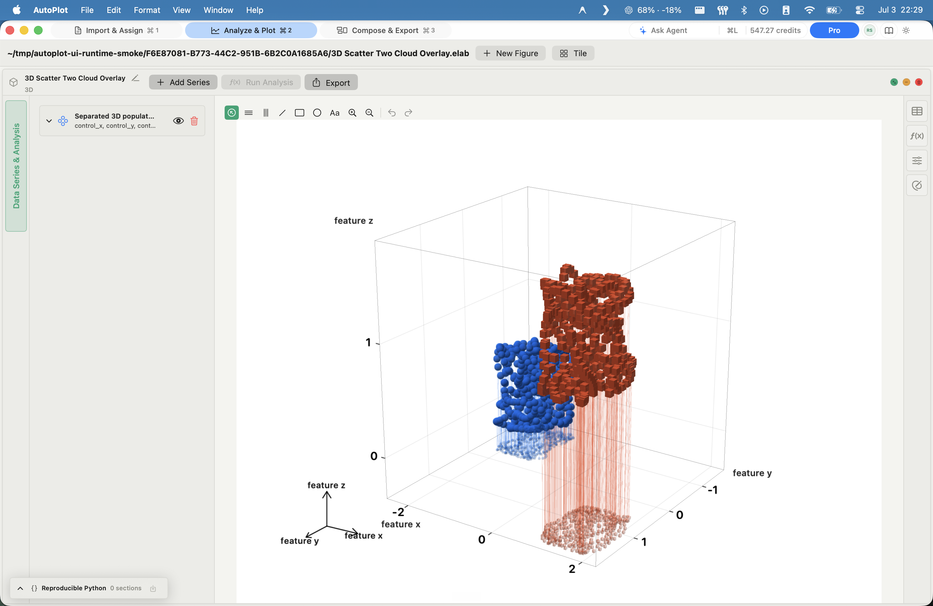
AutoPlot 3D scatter plot screenshot

3D scatter plot

Plus

Inspect point clouds in real 3D, with overlays and depth cues.

In
x, y, z points (one or more series)
Method
3D point cloud; per-series styling; base-plane footprints and stems; camera and projection control
Out
An interactive 3D scatter scene
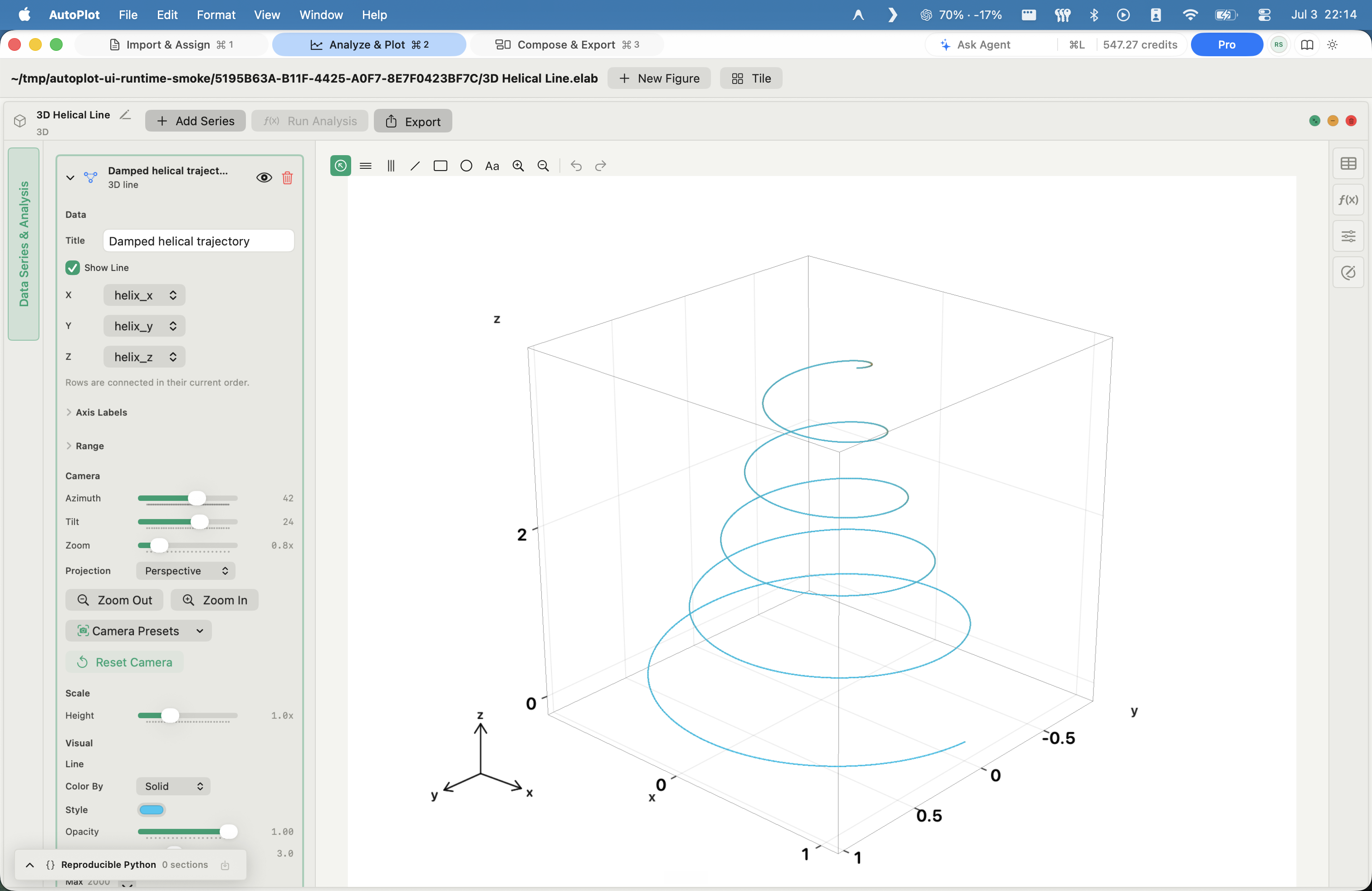
AutoPlot 3D line plot screenshot

3D line plot

Plus

Trace trajectories and parametric curves through 3D space.

In
Ordered x, y, z
Method
3D polyline through ordered points; camera and projection control; base-plane footprint
Out
An interactive 3D trajectory

Categorical

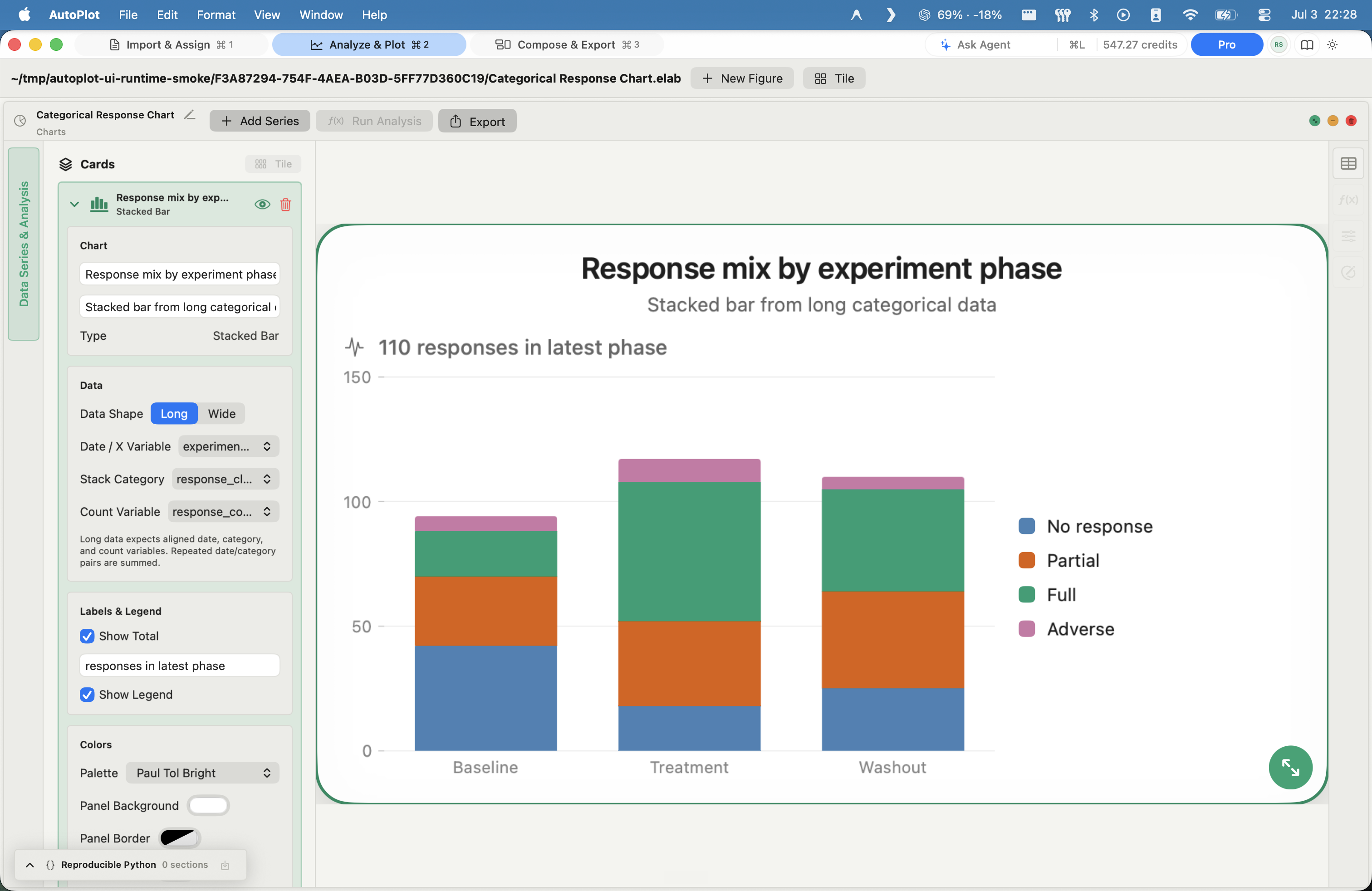
AutoPlot Charts - pie, donut, stacked bar screenshot

Charts - pie, donut, stacked bar

Plus

Show categorical composition as pies, donuts, or stacked bars.

In
A category or date source + a numeric value
Method
Pie, donut, or stacked bar (long or wide layout); sums repeated categories; sort; palette, legend, titles
Out
A categorical chart with legend, counts, and percentages

Relationships

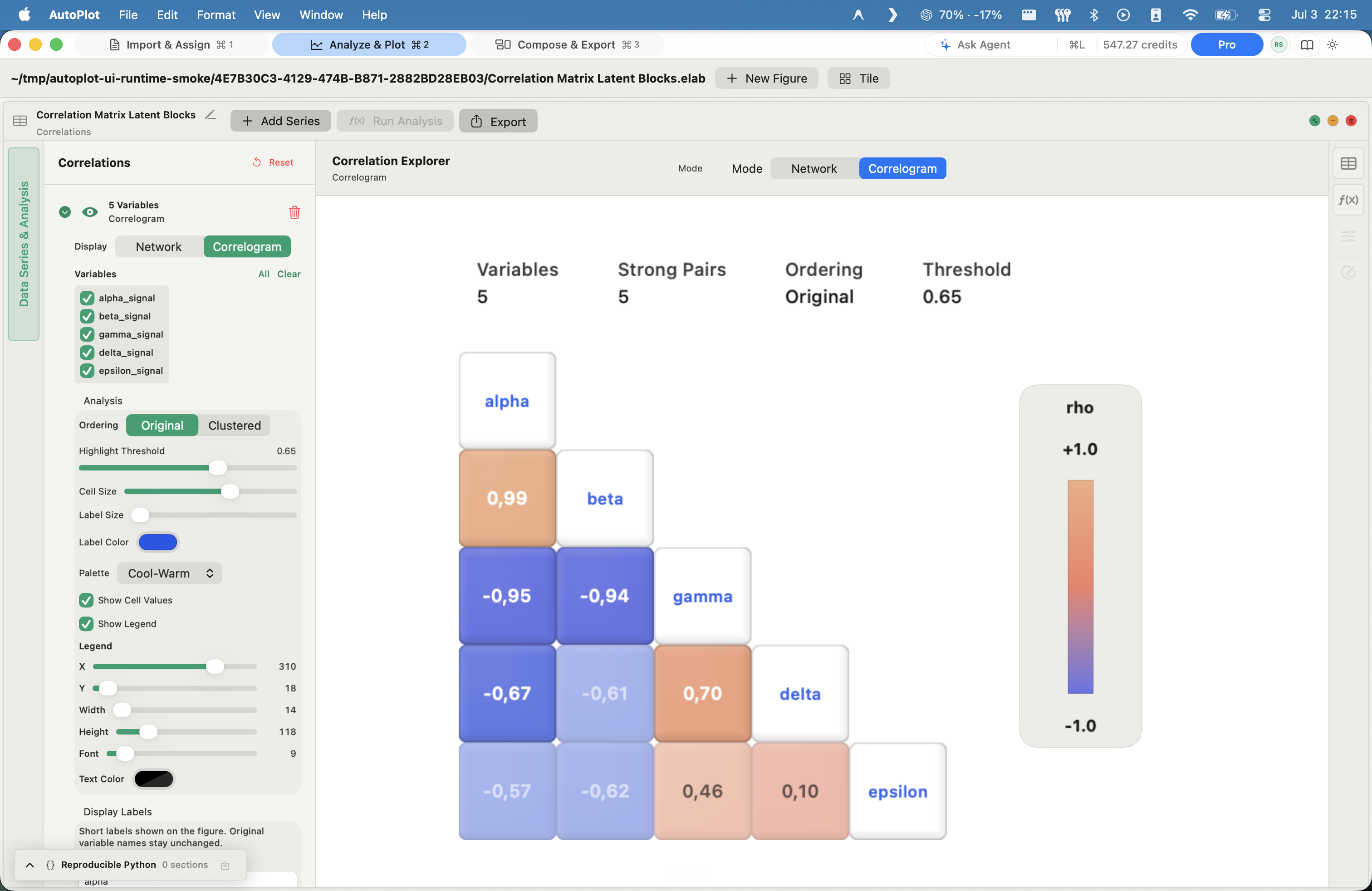
A separate figure type, not an analysis card: the Correlations workspace screens pairwise correlations across variables. You create it with Add Series, like any other figure.

AutoPlot Correlation matrix screenshot

Correlation matrix

Plus

Find latent variable blocks before you build a model.

In
Two or more numeric variables
Method
Pairwise Pearson correlation on row-aligned values; correlogram view; original or clustered ordering; strength threshold
Out
A correlogram colored by r, with a strong-pair count
AutoPlot Correlation network screenshot

Correlation network

Plus

Turn strong correlations into a graph of clusters and bridges.

In
The same correlation view
Method
Network mode of the correlation card: variables as nodes, strong pairs above the threshold as edges colored by the sign and strength of r
Out
A node-edge graph of the strong relationships

Run vetted Python on a figure

Analysis cards run a pre-vetted, golden-master Python implementation and write the result back as variables you can re-plot, fit again, or export.
Raw values never leave your Mac.

Distributions & fits

Run Analysis cards on an X&Y figure.

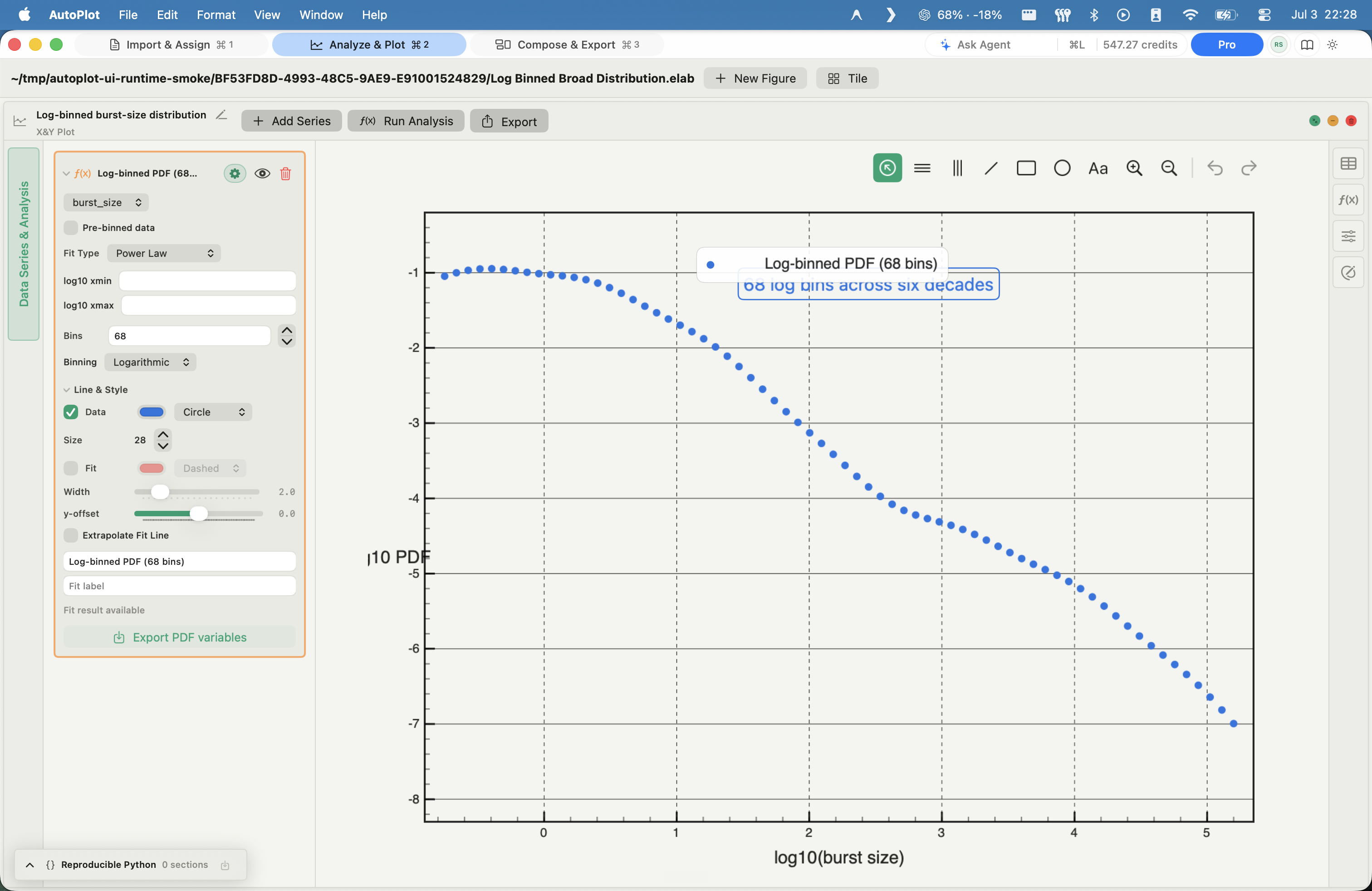
AutoPlot Log-binned density (PDF) screenshot

Log-binned density (PDF)

Free

Read broad positive distributions clearly on log-log axes.

In
One strictly positive variable
Method
Logarithmic bins, geometric-mean centers, density-normalized; empty bins dropped
Out
Probability density function (PDF) in log-log coordinates
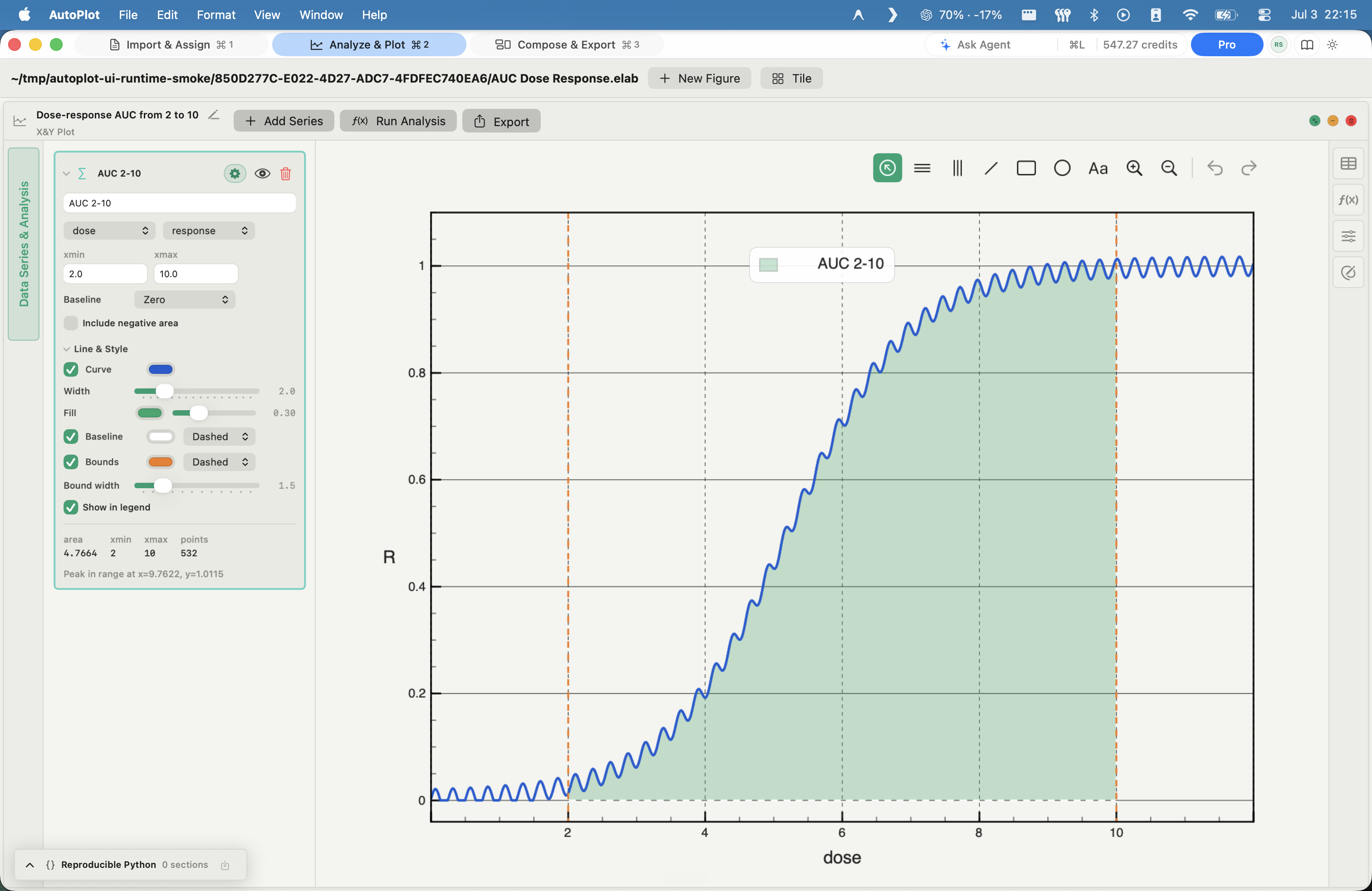
AutoPlot AUC - area under curve screenshot

AUC - area under curve

Plus

Measure exposure with baseline-subtracted trapezoidal integration over a chosen range.

In
A paired X/Y curve + an x-range
Method
Baseline-subtracted trapezoidal integration computed in Swift; endpoint interpolation; signed or clamped area
Out
Area over the chosen range, with the integrated region shaded
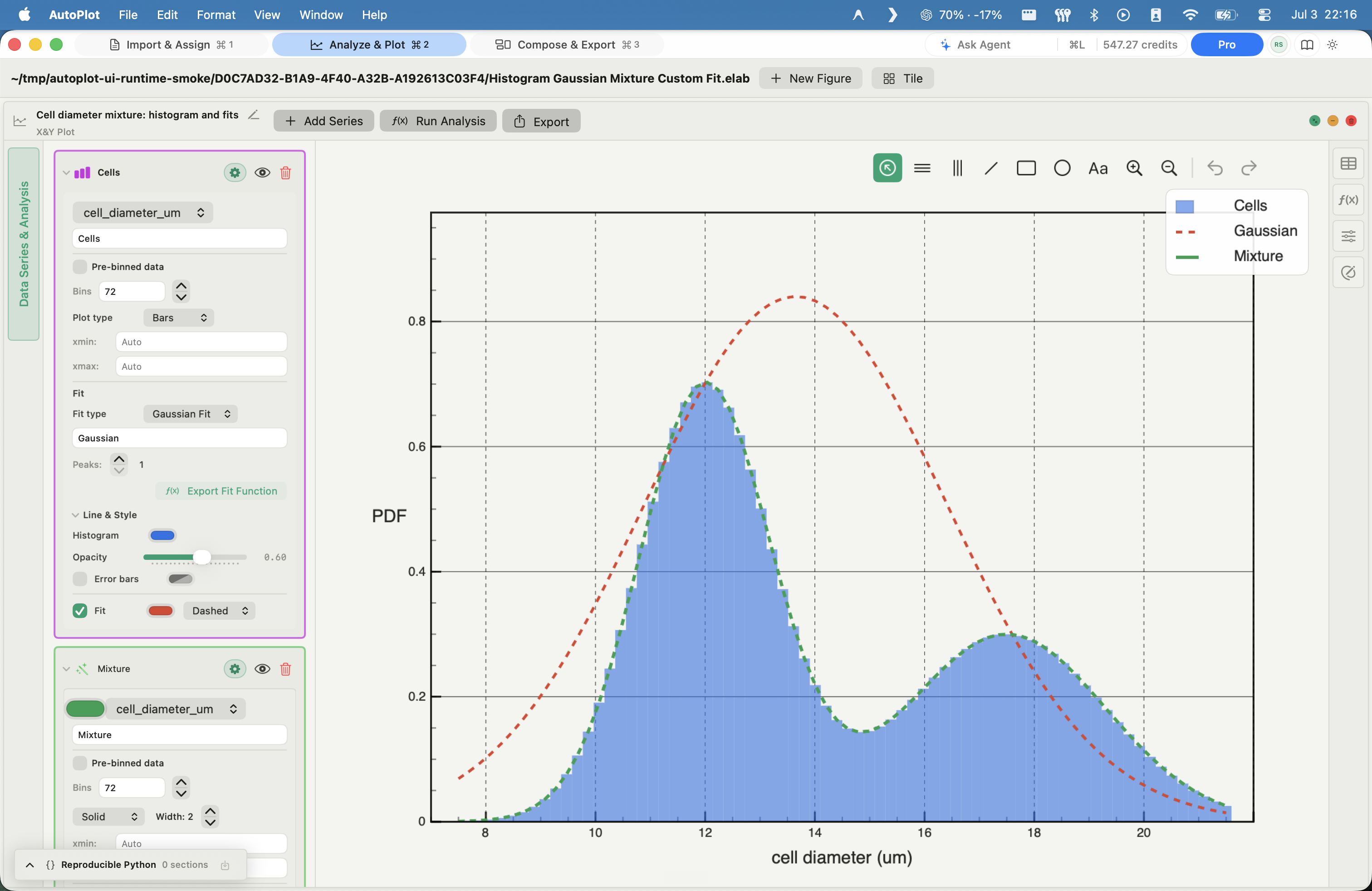
AutoPlot Histogram Fit screenshot

Histogram Fit

Free

Fit binned densities with Gaussian mixtures or custom formulas.

In
A histogram's bins (one numeric variable)
Method
Nonlinear least squares: a one- to three-component Gaussian mixture, or a predefined / custom formula
Out
Fitted components and residuals as variables, with R-squared

Heavy tails & scaling

The defensible core - stated to the depth the app actually computes.

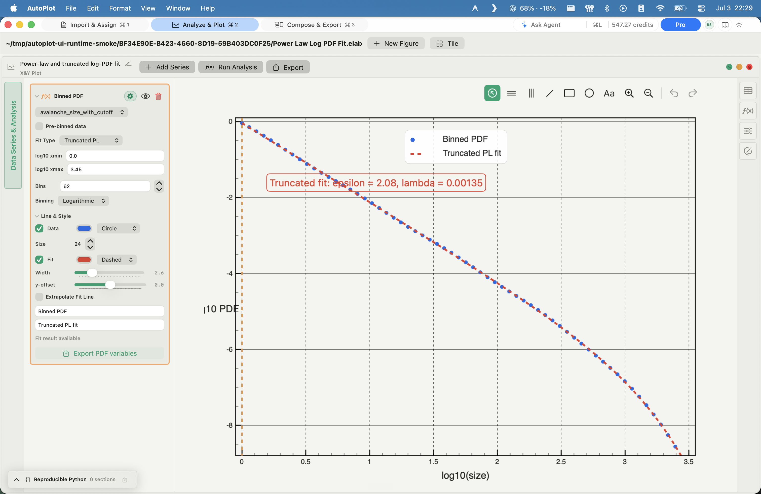
AutoPlot Power-law & truncated power-law fit screenshot
  1. Fit type, logarithmic binning, and the fit range are set per card.
  2. The least-squares slope of the log-binned PDF is the exponent alpha.
  3. Every result keeps a reproducible Python trace.

Power-law & truncated power-law fit

Free

Fit tails honestly: log-binned least squares, deliberately not billed as a maximum-likelihood estimate.

In
Positive samples (raw or pre-binned)
Method
Log-binned PDF; least-squares slope in log-log gives exponent alpha, prefactor A, R-squared; truncated power law A x^-epsilon e^-lambda x by SciPy curve fit
Out
Exponent alpha (or epsilon, lambda), A, R-squared, and the fit drawn over the data
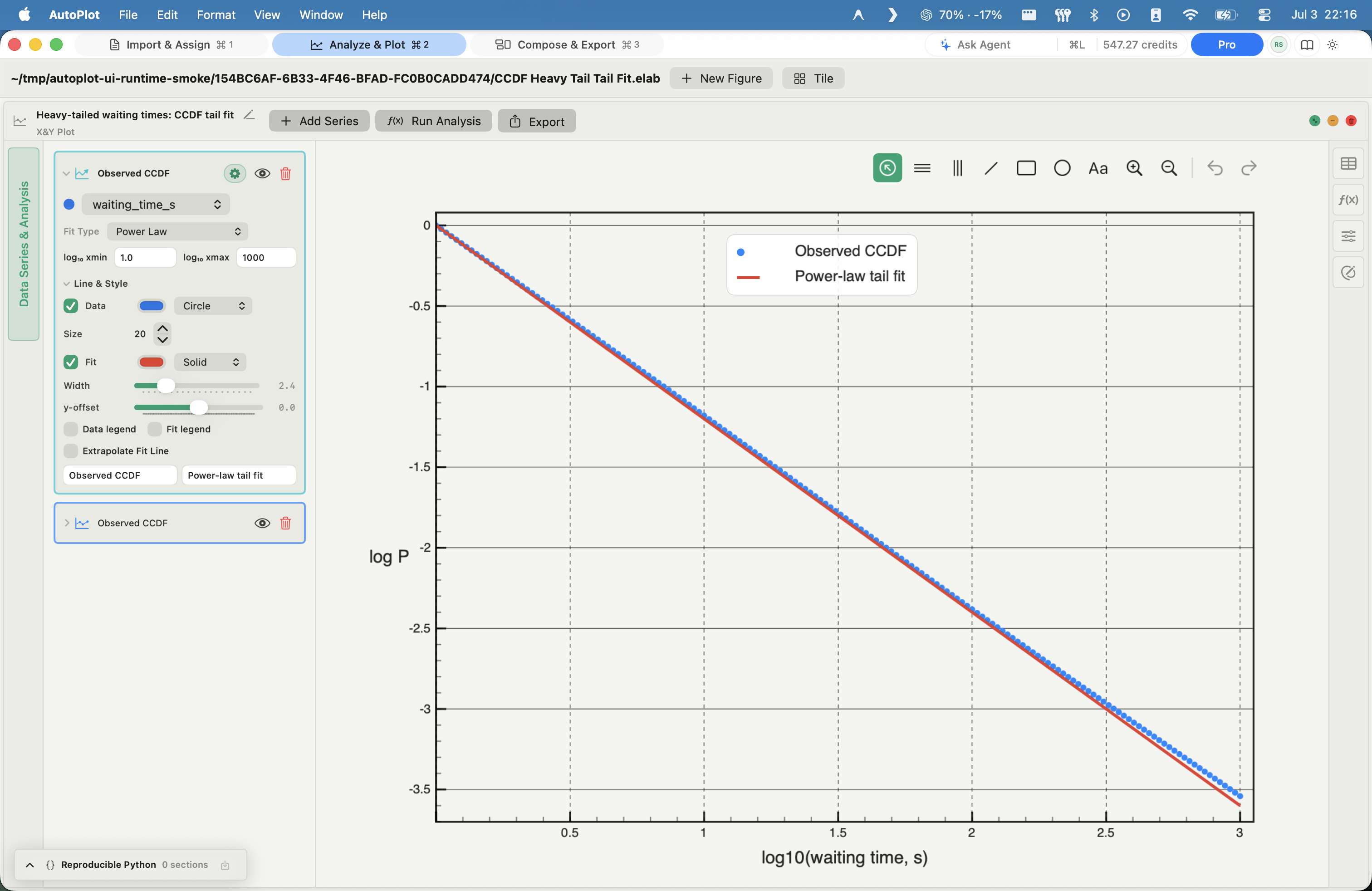
AutoPlot CCDF tail fit screenshot

CCDF tail fit

Plus

Inspect tails without binning through the Python powerlaw library.

In
One strictly positive variable
Method
Empirical complementary cumulative distribution P(X >= x); tail model fit via the Python powerlaw library; shown in log-log
Out
Log-log CCDF with the fitted tail parameters in natural units
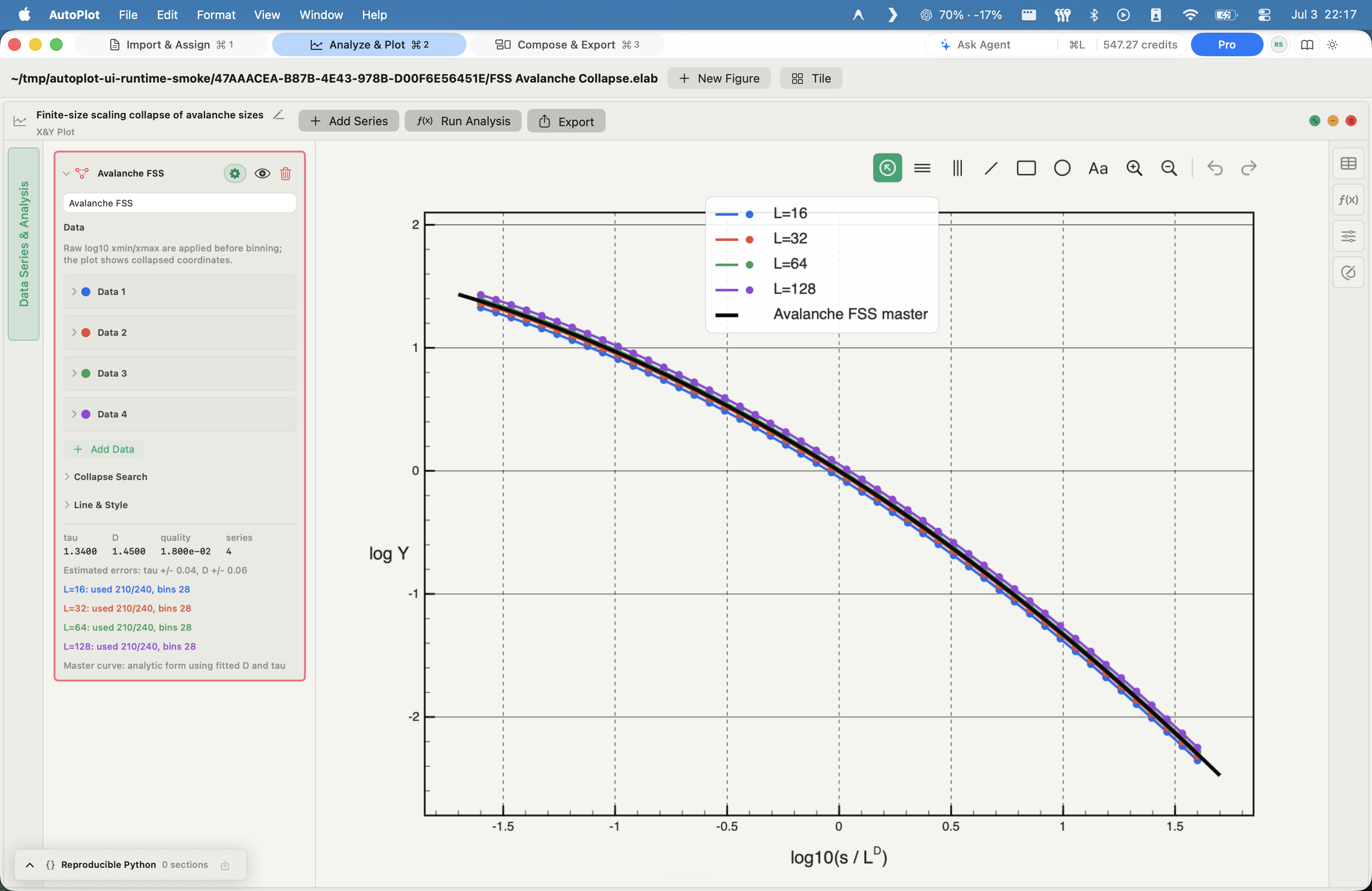
AutoPlot Finite-size-scaling (FSS) collapse screenshot

Finite-size-scaling (FSS) collapse

Plus

Collapse finite-size distributions and report fitted exponents with uncertainty.

In
Several positive datasets at different system sizes L
Method
PDF-bin each dataset, then grid-search the exponents (tau, D) that minimize a data-collapse residual, with an optional fine search
Out
A shared master curve plus per-exponent uncertainties (tau +/- err, D +/- err) and a collapse-quality score
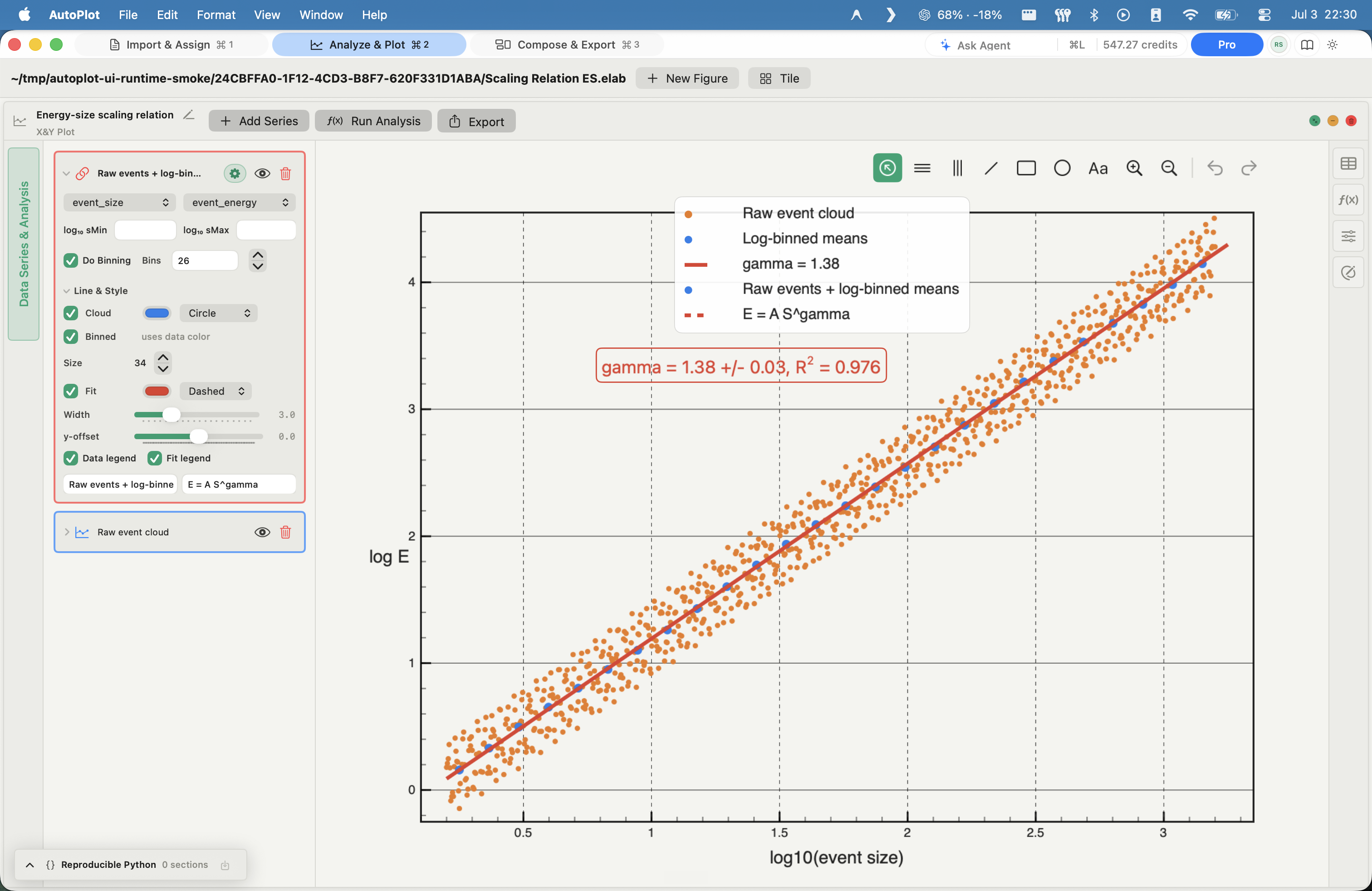
AutoPlot E-S scaling relation screenshot

E-S scaling relation

Plus

Fit E-S scaling in log-log space and take the exponent.

In
Two strictly positive variables (E versus S)
Method
Optional log10 binning along S; linear regression in log-log space
Out
Scaling exponent gamma, prefactor A, R-squared
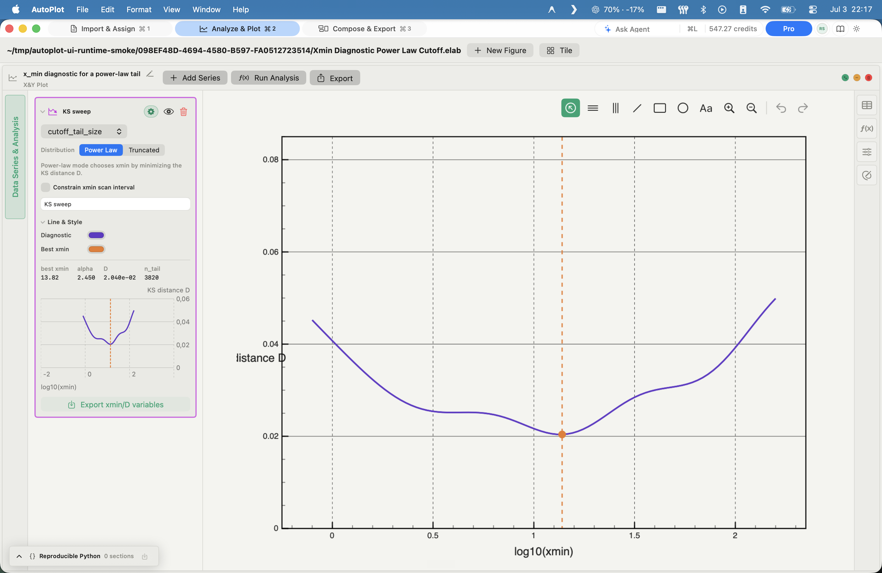
AutoPlot Xmin diagnostic screenshot

Xmin diagnostic

Plus

Choose the tail cutoff with a Kolmogorov-Smirnov (KS) distance scan.

In
One strictly positive variable
Method
Scan candidate lower cutoffs; compute the Kolmogorov-Smirnov (KS) distance D at each; select the x_min with the smallest D
Out
A D-vs-candidate curve, the selected x_min, and exported candidate arrays

Surface & density fits

Run Analysis cards on a Heat Map or 3D figure.

AutoPlot Density-map fits screenshot

Density-map fits

Plus

Fit point-cloud density fields as Gaussian or custom surfaces.

In
Paired x, y points, or a binned density field
Method
Joint Density Map bins x/y into a density, probability, or count map; 2D Density Fit and Custom Density Fit fit a Gaussian or a custom formula to that field
Out
A fitted density field and parameters, as variables
AutoPlot Surface fits (2D & 3D) screenshot

Surface fits (2D & 3D)

Plus

Fit z = f(x, y) surfaces and send contours back as variables.

In
A scalar surface z = f(x, y), on a heat map or in 3D
Method
2D Gaussian / Custom Surface Fit on a heat map; 3D Gaussian / Custom Surface Fit in the 3D workspace; returns fitted contours and a sampled surface
Out
Fitted surface parameters and sampled z, as variables

Publish without an image editor

Assemble panels, annotate, restyle every axis and legend, and export at journal sizes and resolutions - the entire publishing step in one app, with no round-trip to an image editor.

Compose & reproduce

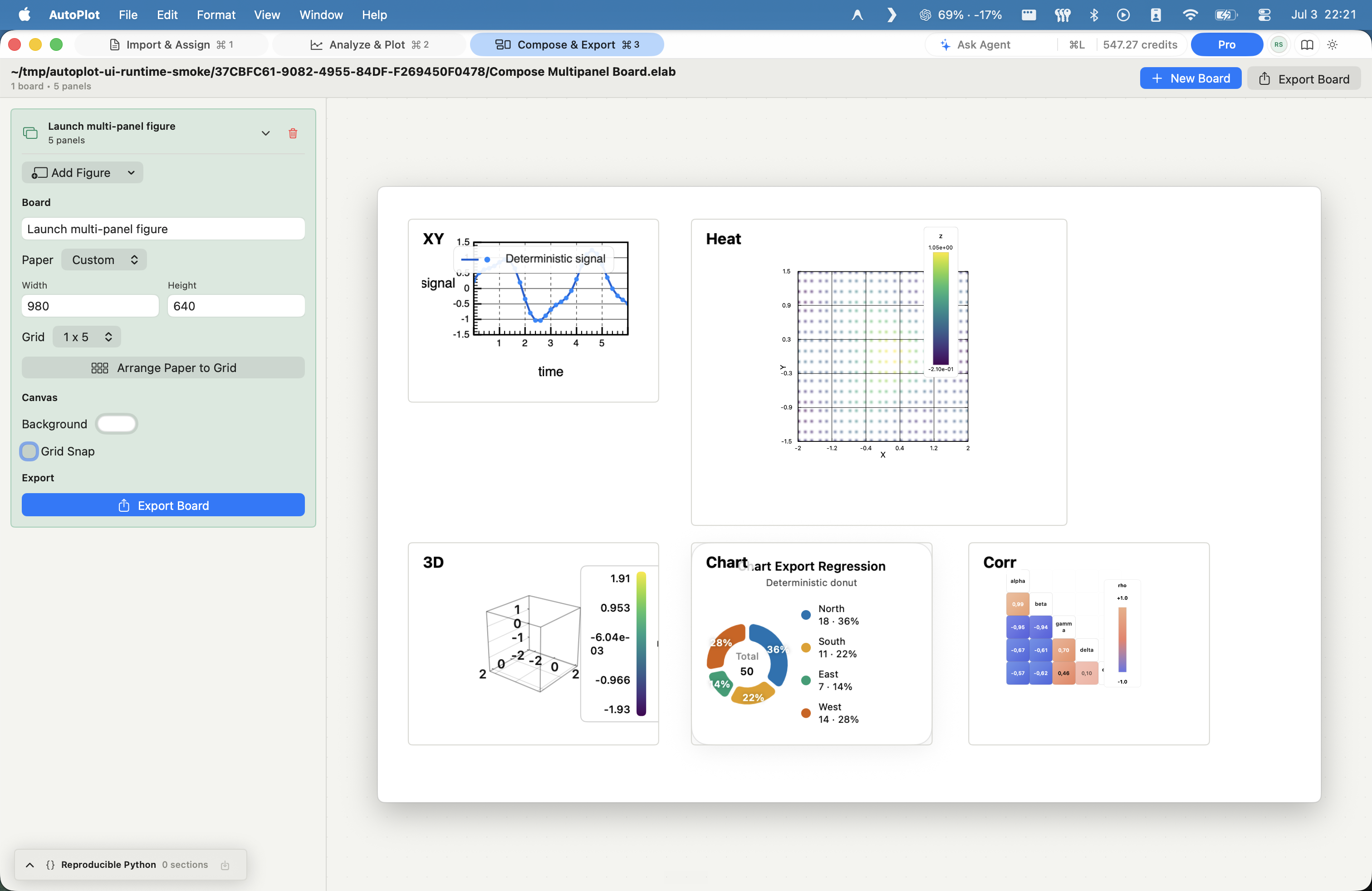
AutoPlot Compose - multi-panel boards screenshot

Compose - multi-panel boards

Plus

Assemble synced panels into one exportable board.

In
Any finished figures and analysis outputs
Method
Paper-backed board; drag, resize, grid snap (10 / 50 pt); align left/center/right/top/middle/bottom and distribute; crop; per-panel labels; A4, Letter, or custom paper
Out
A composed multi-panel figure, exported as one file
AutoPlot Reproducible Python screenshot

Reproducible Python

Leave with runnable Python that regenerates the result.

In
Your analysis
Method
The Reproducible Python panel assembles a runnable Python + Matplotlib trace of the steps that produced the result
Out
A script that regenerates the figure outside the app

Finish without an image editor

Everything you would otherwise leave the app for - done where the figure lives.

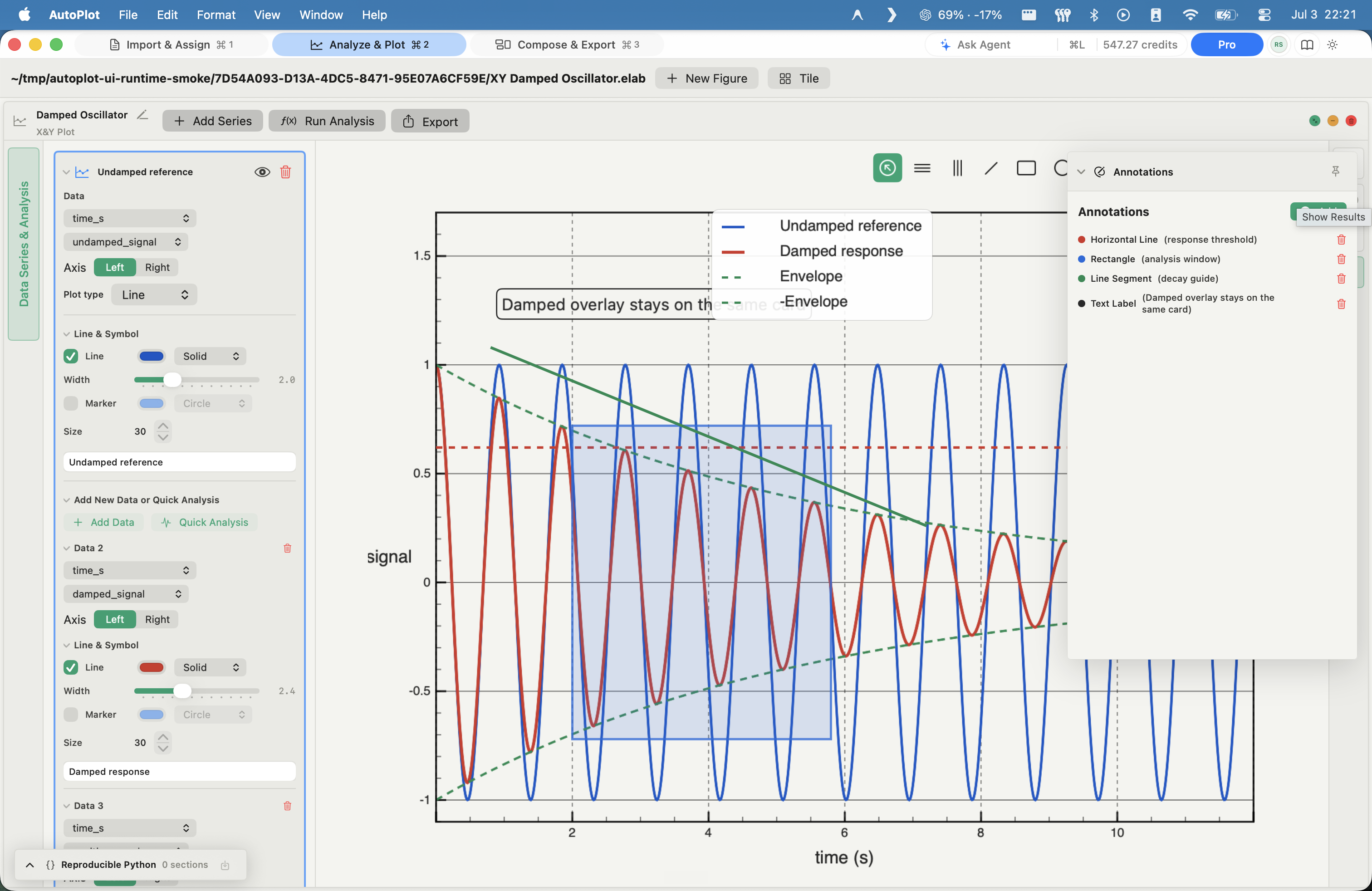
AutoPlot Annotate screenshot

Annotate

Add labels, lines, boxes, and circles where the figure lives.

In
Any figure or board
Method
Horizontal, vertical, and segment lines; rectangle; circle; text label - each with color, width, line style, and opacity; undo/redo and copy/paste
Out
Annotated figures, no external editor
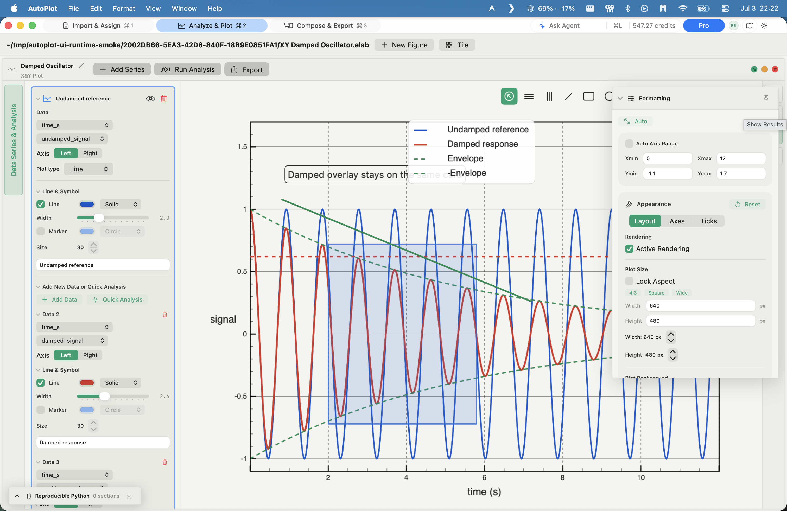
AutoPlot Style every axis and legend screenshot

Style every axis and legend

Restyle axes, legends, colors, fonts, and backgrounds in place.

In
Any figure
Method
Axes (labels, ticks, gridlines, border); legends (placement, background, border, font); colors and palettes; fonts; plot size and background
Out
A fully restyled figure
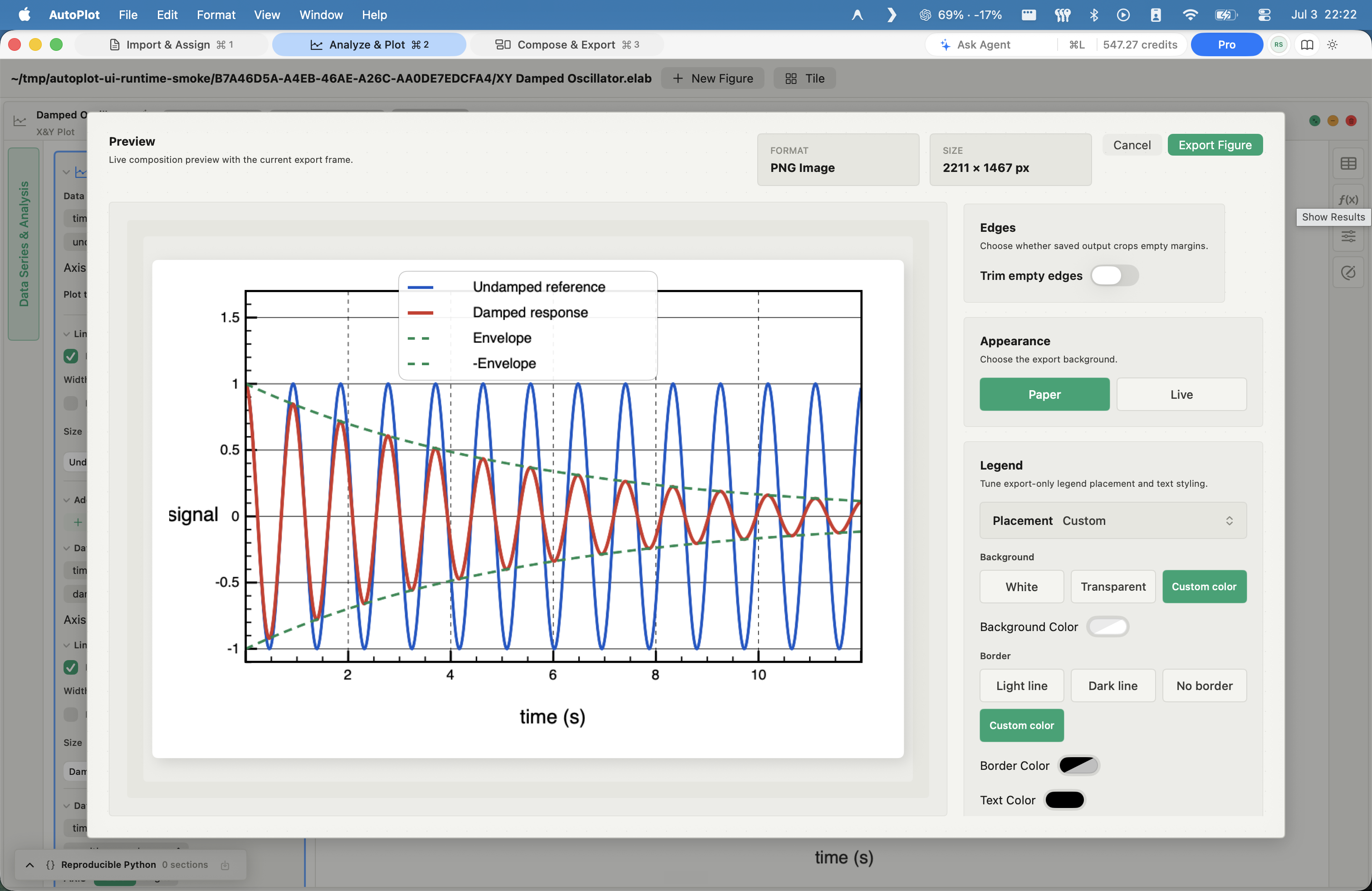
AutoPlot Export at journal specs screenshot

Export at journal specs

Export journal-spec PDF, PNG, or JPG at the required size.

In
Any figure or board
Method
Vector PDF (embedded fonts), PNG, or JPG; 150 / 300 / 600 DPI; presets for Nature, PRL, and A4; custom size in mm, inches, or pixels; aspect ratios 1:1, 4:3, 16:9, golden, or custom
Out
Publication-grade files at the exact size and resolution

Why Autoplot

One window, from raw data to the paper figure.

The usual setup is a relay: pull the run files off a server, wrangle them in a notebook, plot in another library, then patch the figure in an image editor - and run the whole chain again every time a reviewer asks for one change.

Autoplot is the native Mac workstation that does it all in one place - import and clean, the heavy-tail and scaling analysis you can defend, the journal-grade figure, and the Python that reproduces it - with your raw data never leaving your machine.

  • Raw data to paper figure, in one app
  • Heavy-tail and scaling analysis you can defend
  • Your raw data never leaves your Mac

Ready when you are

Download the Mac build and try the full plotting workflow.