On this page
- The quick path in Autoplot
- Set the figure size before you arrange anything
- Build each panel at the size it will occupy
- Align panels and label them a, b, c
- Export the board and check the saved file
- Acceptance checklist for a multi-panel figure
- Compose in Autoplot, and where it stops
- Frequently asked questions
The quick path in Autoplot
Compose, Autoplot's layout tab, follows the order above. In short:
- Finish each figure in Analyze & Plot: variables, filters, fitted range, axes, units and legend.
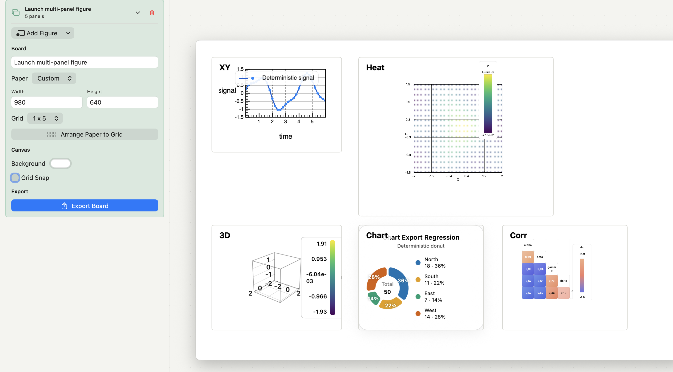
- Open Compose & Export and click New Board. Name it and choose Paper: A4, Letter or Custom (width and height in points).
- Click Add Figure in the dock under the paper and pick a figure by name.
- In Add Figure to Compose, set the snapshot's size and resolution, check the preview, then click Add to Compose.
- Drag panels into place with Grid snap on, or choose columns × rows in the Grid menu and click Arrange Paper to Grid.
- Select each panel and set its label in the Label tab.
- Clear any warning above the paper about panels outside the paper or below a readable size.
- Click Export Board, choose PNG, JPEG or PDF, and inspect the saved file.
The sections below explain the decisions behind each step, so they apply in any tool.
Set the figure size before you arrange anything
Journals specify figures by column width, usually a single and a double column, with a maximum height. Nature, for example, uses 89 mm and 183 mm with a 170 mm maximum height. Start there. A layout that works at full screen can become unreadable once it is reduced to 89 mm.
In Compose, custom paper is set in points: multiply millimetres by 72/25.4. A 183 mm double-column figure is about 519 pt wide; an 89 mm single column is about 252 pt. Set the board to that width and a height within the journal's limit, so every distance on the board is a real distance on the page.
Then sketch the reading order. Lead with the panel that carries the main result, keep views that are compared next to each other, and leave room for shared legends. A plain grid of equal panels is usually easier to read than a dense mix of sizes.
Build each panel at the size it will occupy
A Compose panel is a PNG snapshot of the source figure, rendered with the export settings you chose in Add Figure to Compose. The panel starts at the snapshot's own size. If you later drag it larger or smaller, the snapshot is scaled, and its tick labels and line weights scale with it.
That is the usual cause of a multi-panel figure where one panel's text is visibly larger than its neighbour's. The fix is to set the snapshot's output size to the space the panel will take on the board, and then leave the panel at that size.
- Shared scales: when panels are meant to be compared, give them the same axis ranges and the same colour limits, and say so in the legend.
- One treatment per quantity: the same variable keeps the same colour and marker across panels.
- Resolution: because panels are raster snapshots, choose 600 DPI for line art and small text in the snapshot settings.
- Margins: turn on Trim empty edges in the snapshot's Canvas settings to remove white space around the plot without changing its scale.
If a source figure changes after you placed it, the panel does not update by itself. Refresh Snapshot re-renders it from the current figure with the stored settings; Edit Snapshot reopens the settings. Compose never recomputes an analysis, so correct the source figure, then refresh.
Align panels and label them a, b, c
Alignment
Turn on Grid snap in the dock to move and resize panels in 10-point steps, which keeps edges and gaps consistent by eye. For a regular layout, choose columns × rows in the Grid menu and click Arrange Paper to Grid. It keeps panel sizes, places the panels with equal gaps and margins, and fits the paper around them. Because the paper size changes, check the board width against the journal's column width afterwards.
Panel labels
Panel labels are set per panel in the Label tab: Show Label, Text, Sequence, Weight, Position, Font Size, Text Color and Offset. Sequences are a b c, A B C, 1 2 3 and i ii.
Follow the journal's style rather than habit. Nature asks for 8-pt bold, upright lowercase letters; other journals use capitals. Whatever the style, keep one corner, one offset, one size and one weight across the figure, and make the label text match the figure legend exactly.
Legends and colour bars
The Legend tab (Colorbar for heat maps) overrides placement and styling for one panel without changing the source figure. Where several panels share a colour scale, one colour bar for the group is cleaner than five copies.
Export the board and check the saved file
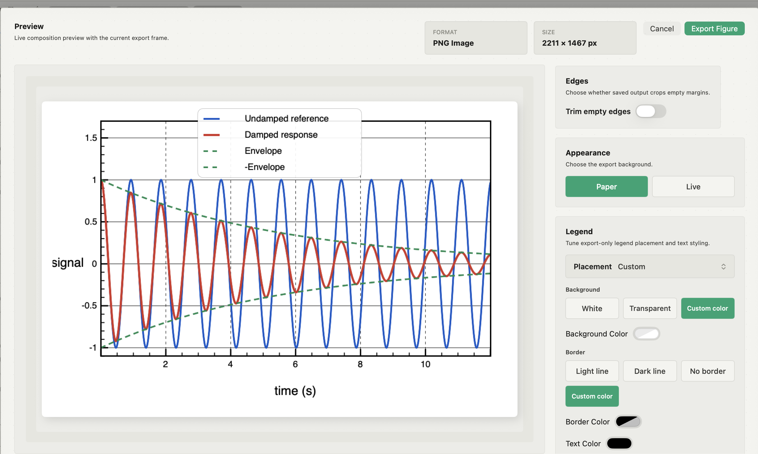
Click Export Board and choose PNG, JPEG or PDF. Set the output size and resolution, the background (Paper, Dark or Transparent) and Trim empty edges. Then open the saved file outside Autoplot and look at it at 100% of its printed size.
A PDF board does not make the panels vector. Each panel is still a PNG snapshot inside the PDF, which is why the snapshot resolution matters. If the journal wants fully vector line art, export each figure as Vector PDF and assemble those files in a vector layout program. How to export a vector PDF figure covers formats, sizes and what stays vector, and how to embed fonts in a figure PDF covers the font check.
Acceptance checklist for a multi-panel figure
- Every panel shows the intended data, filter, model and fitted range, and its snapshot is current.
- The board width matches the journal's column width; the height is within its limit.
- Text, tick labels and line weights look the same size across panels at the final size.
- Comparable panels share axis ranges and colour limits, and the legend says so.
- Labels use one sequence, corner, size and weight, and match the figure legend.
- No panel extends outside the paper; nothing is clipped by trimming.
- The saved file opens independently and matches the required format, size and resolution.
For the plots themselves, see how to plot CSV data on a Mac and, for colour-mapped panels, heat maps for scientific data.
Compose in Autoplot, and where it stops
Compose is part of Plus. It keeps boards in the same local project as the data and figures, records the source figure and export settings for every panel, and exports the whole board as one PNG, JPEG or PDF file.
Limits worth knowing: panels are raster snapshots, so a board exported as PDF contains raster panels. Compose has no lock toggle; locking a panel or its aspect ratio is done through the assistant, which can also build a board from a request such as putting three named figures on a board at Nature double-column size. The Reproducible Python trace does not replay a Compose layout. When you need a fully vector composite or a layout Compose cannot express, export the figures as Vector PDF or as editable Matplotlib scripts and assemble them in your own tools. See the features page for the full export list.
Frequently asked questions
| Should panel labels be uppercase or lowercase? | Whichever the journal specifies. Nature asks for 8-pt bold lowercase letters; many other journals use bold capitals. Check the author guidelines and use the same style in the figure legend. |
|---|---|
| Why does the text look different sizes in different panels? | The panels were made at different sizes and then scaled to fit. Re-export each panel at the size it occupies in the final figure, with the same font sizes in every source plot. |
| Can I combine plots into one figure without a layout program? | Yes, if the plotting tool has a page layout. Autoplot's Compose places finished figures on a paper-sized board; in Matplotlib, subplots or subfigures do the same in code. |
Sources
Compose behaviour comes from the app's documentation for Compose and Export, checked on 9 October 2026, and from the features page. Column widths and panel-label conventions come from Nature's figure specifications and its guide to building and exporting figure panels. Check the receiving journal's current figure guidelines before submission.