On this page
Gridded data, scattered points or a 2D histogram
Start from what the rows represent. The same three columns can mean very different things.
| Input | What to do | Example |
|---|---|---|
| A complete regular grid of z values | Draw the cells directly; no binning needed | Simulation output, image-like scans |
| Scattered observations with x, y and z | Bin into cells and aggregate z per cell | Sensor readings at irregular positions |
| Paired x and y only | Count samples per cell: a 2D histogram or joint density | Two measured quantities per event |
Check that x, y and z describe the same observations in the same row order. Most tools pair columns by position, so a shifted or independently sorted column produces a confident-looking map of nothing.
Binning scattered observations is a summary, not interpolation. A cell's colour describes the observations that fell into it, not the value at its centre. A correlation matrix is drawn as a heatmap too, but its cells are relationships between variables, not values over a plane; see how to read a correlation matrix heatmap.
Heatmap binning: cell shape and resolution
Rectangular cells are easy to read against the axes and give a complete grid, so empty regions stay visible as gaps. Hexagonal cells have more uniform neighbour distances and reduce the visual artefacts of a square grid; many implementations draw only occupied hexagons, which hides where there are no data unless you show the extent another way.
Resolution is the main trade-off. Too coarse a grid merges distinct structure; too fine a grid leaves most cells with one or two samples and turns noise into speckle. There is no universally correct cell count:
- Start from a resolution where most occupied cells hold several samples.
- Rebuild the map at roughly half and double that resolution.
- Keep the features that survive all three; treat the rest as resolution-dependent.
- Report the cell count or cell size with the figure.
Choose the statistic per cell
When several observations fall into one cell, an aggregation reduces them to one value. This is a scientific choice, not a styling one.
| Statistic | Answers |
|---|---|
| Mean | What is the typical z here? Sensitive to outliers. |
| Median | What is the typical z, robust to a few extreme samples? |
| Sum | How much of the quantity accumulated here? |
| Min / Max | What are the limits reached in this region? |
| Standard deviation | How variable is z within the cell? |
| Sample count | How much data supports each cell? |
Pair the statistic you report with a sample-count map, at least while you work. A bright mean built from one observation carries much less weight than the same mean from a hundred.
Empty and sparse cells
An empty cell means no observation landed there. Show it as empty, with a neutral background colour outside the colour map, rather than as the lowest colour on the scale, which reads as a measured minimum.
Sparse cells are harder. Common remedies, in order of preference:
- Coarsen the grid until most occupied cells have enough samples.
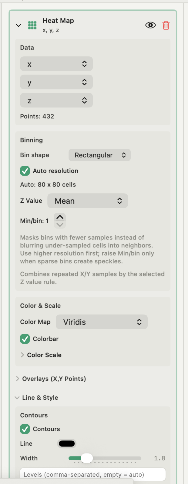
- Mask cells below a minimum count, so they appear empty rather than confident.
- Show the count map beside the result, or as an inset, when coverage varies strongly across the plane.
Do not fill gaps by smoothing or interpolation unless the method is stated and the filled region is marked.
2D histograms and joint density
With only x and y, the cell value is the number of samples per cell. Three normalisations are common:
- Count: samples in the cell. Depends on sample size and cell size.
- Probability: count divided by the total number of samples. Cells sum to one.
- Density: count divided by the total and by the cell area. Comparable across different cell sizes and shapes, and integrates to one.
Use density when maps with different resolutions or bin shapes must be compared. The same logic applies in one dimension; see histogram normalization.
Heatmap color scale and limits
Choose the colour map from what the values mean:
- Sequential for magnitudes from low to high, such as concentration or count. Perceptually uniform maps like viridis keep equal steps in data looking like equal steps in colour.
- Diverging when a centre value such as zero or a reference separates two directions. Put the centre at that value, not at the middle of the data range.
- Cyclic for angles and phase, where the ends of the range meet.
Avoid rainbow and jet maps: their uneven lightness creates bands that are not in the data, and they fail for many colour-blind readers. Automatic limits suit exploration, but two maps with different automatic ranges give the same colour different meanings. Fix the limits when figures are compared, and consider a logarithmic normalisation when values span orders of magnitude. Keep the colorbar, with units, on every published map.
Contours and smoothing
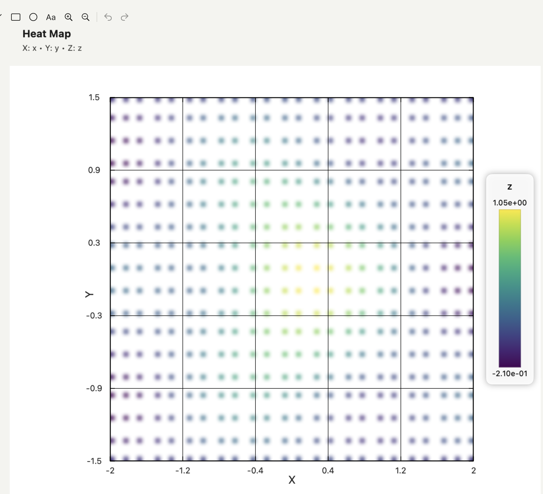
Contours should mark levels of the same field the colours show. Choose explicit levels when particular thresholds matter, and do not let lines suggest more precision than the cell size allows.
Smoothing softens cell boundaries in the rendering. It does not change the binned values, and a conclusion that depends on the smoothed look rather than the cells is not supported by the data. If three coordinates must stay explicit rather than being collapsed into colour, a 3D scatter plot may serve better.
Making a heat map in Autoplot
In a Heat Map figure, Add Plot → Heat Map takes numeric X, Y and Z. Bin shape is Rectangular or Hexagonal; Auto resolution picks the cell count, or you set Cells X and Cells Y (or Hex Density). Z Value offers Mean, Median, Sum, Min, Max, Std Dev (population) and Sample Count. Rows are paired by position, rows with a non-finite value are skipped, and a manual X/Y range excludes rows outside it. Rectangular maps keep the full grid, with empty cells holding no value (NaN); hexagonal maps contain occupied cells only.
Manual Scale fixes the colour limits with Vmin and Vmax without changing the binned values. Contours take explicit or automatic levels, and Overlay Series draws raw X/Y points or a line over the map. Smoothing is applied in the rendering only. For x and y without z, Run Analysis → Joint Density Map reports Count, Probability or Density per cell, and the density and surface fits add Gaussian or custom 2D models. Binned cells, with their centres and values, can be exported back into the project as variables.
Heat maps are part of Plus. To see support, add a second map of the same data with Sample Count as the Z value. See the features page for the fits.
Frequently asked questions
| What is the difference between a heatmap and a 2D histogram? | A 2D histogram is a heatmap whose cell value is the number of samples. A general heatmap can show any statistic of a third variable per cell, such as a mean or a maximum. |
|---|---|
| How many bins should a heatmap have? | Enough that most occupied cells hold several samples, and few enough that real structure is not merged. Compare the map at half and double your chosen resolution and keep only features that survive. |
| Which colour map is best for a scientific heat map? | A perceptually uniform sequential map such as viridis for magnitudes, and a diverging map centred on a meaningful value for signed data. Avoid rainbow maps. |
Sources
Autoplot behaviour comes from the app's documentation for heat map figures and the heat map binning algorithm, checked on 9 October 2026, and from the features page. Matplotlib's guides to choosing colormaps and colormap normalisation explain perceptual uniformity and logarithmic scales. Crameri, Shephard and Heron, The misuse of colour in science communication, documents the distortions rainbow maps introduce.