On this page
The four histogram normalizations compared
For bin i with count nᵢ and width wᵢ, out of n included observations:
| Quantity | Bar height | Sums to | Answers |
|---|---|---|---|
| Count (frequency) | nᵢ | n, over the heights | How many observations fell in this interval |
| Proportion (relative frequency) | nᵢ / n | 1, over the heights | What share of the sample fell here |
| Percentage | 100 · nᵢ / n | 100%, over the heights | The same share, in percent |
| Probability density | nᵢ / (n · wᵢ) | 1, over height × width | How concentrated the sample is per unit of x |
Counts, proportions and percentages differ only by a constant, so with equal-width bins they draw the same shape on a different axis. Density divides by width as well, which changes the shape as soon as bins differ in width.
Density vs frequency histogram
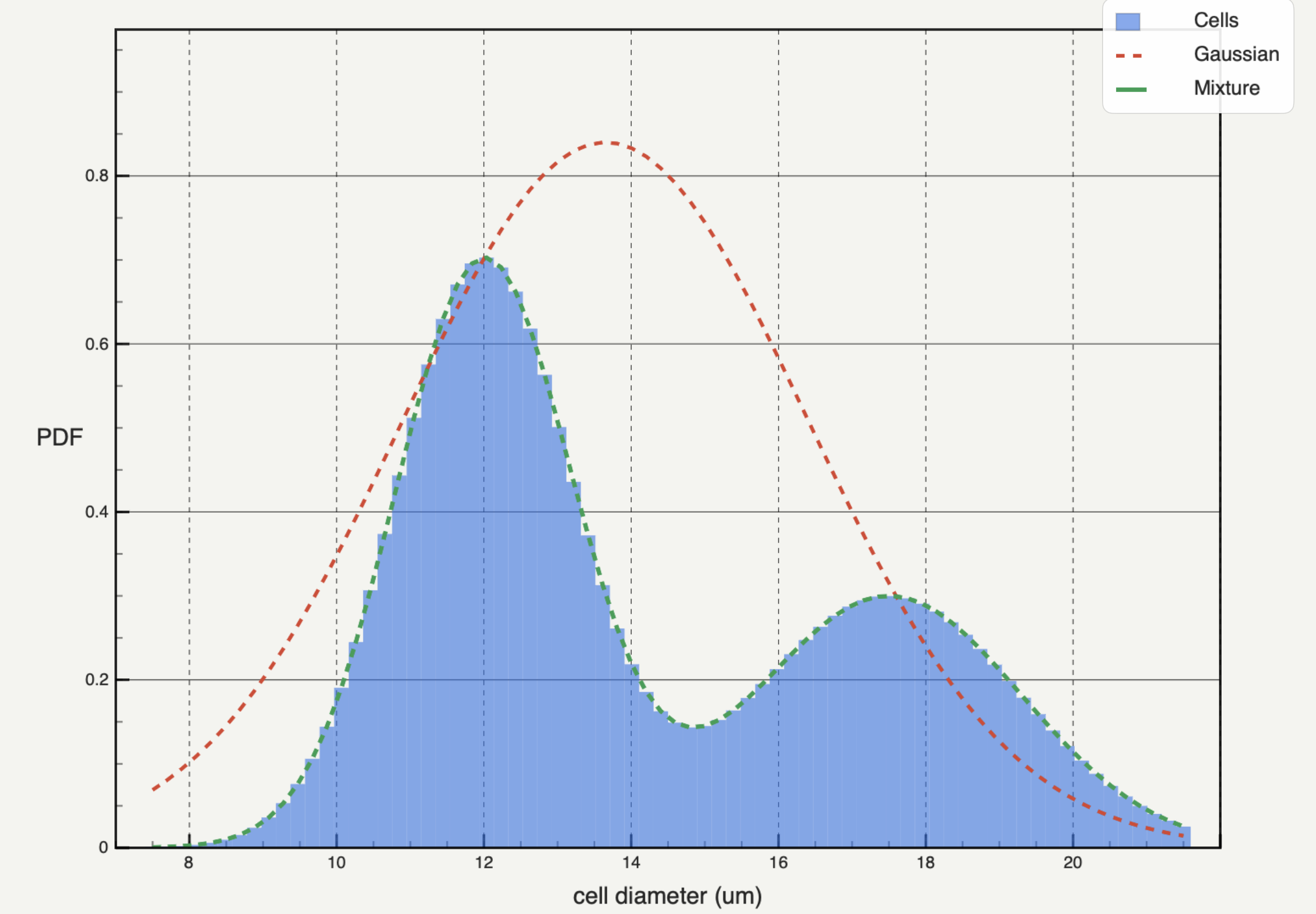
A frequency histogram answers "how many" or "what share". A probability density histogram answers "how much per unit of x", and it is the only one of the four that estimates a probability density function.
Three consequences follow from the division by width:
- Density has units. If x is a diameter in micrometres, density is in µm⁻¹. Label the axis that way.
- Heights can exceed 1. Narrow bins on a variable with a small range produce large densities. Only the area is bounded.
- Heights change with bin width. Halving the width redistributes the same probability over narrower intervals, so individual bars can rise even though nothing about the sample changed.
With unequal widths, density is the only honest choice. A count or proportion axis makes a wide bin look important partly because it covers more of x; dividing by width removes that effect. This is why log binning always reports density.
How to normalize a histogram
- Fix the edges and the included sample. Record the total n after removing non-finite values, range limits and scientific exclusions.
- Count the observations in each bin.
- For proportions, divide every count by n. For percentages, multiply the proportions by 100.
- For density, divide each count by n and by that bin's own width.
- Check the total: counts sum to n, proportions to 1, percentages to 100, and Σ density × width to 1, apart from rounding.
- Label the axis with the quantity and, for density, its units.
In NumPy and Matplotlib
np.histogram(x, bins=edges) returns counts; adding density=True returns density, dividing by each bin's width even when edges are unequal. For proportions, pass weights=np.ones(len(x)) / len(x) and leave density off. Matplotlib's hist takes the same arguments. NumPy normalises over the observations inside the edges, so values outside the range are silently left out of n.
Comparing groups and overlaying models
Use one range and one edge array for every group; the histogram bin width guide covers how to choose them. Then pick the normalisation from the comparison:
- Counts when absolute numbers matter and the groups had comparable observation opportunities.
- Proportions or percentages when the groups differ in size and the question is each interval's share.
- Density when you compare shapes across different bin widths, or overlay a fitted density.
No normalisation repairs incompatible sampling. A group recorded for twice as long, filtered by another threshold or truncated to a different range answers a different question, whatever the axis says.
A probability density model integrates to one, so it does not sit on a count axis. Either plot the histogram as density, or scale the model by n · w for equal-width bins and say so. Weighted histograms need the same care: state what the weights mean and which total they are normalised by.
Normalisation in Autoplot
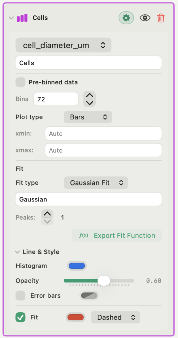
Autoplot's Histogram card, in the free plan, is always density-normalised. There is no count, proportion or percentage toggle: the bars and the values passed to the Gaussian-mixture or custom fit are densities from NumPy's density=True, plotted against arithmetic bin centres. The log-binned PDF card is density-normalised in the same way.
With Pre-binned data, the card accepts centres and densities you supply. It cannot check that they share edges, units or normalisation, so verify that before fitting.
If a figure needs counts or percentages, compute them in your own environment, or ask the assistant to write the Python, which runs on your Mac and stays with the project. Do not relabel the density axis. For two-dimensional data, the Joint Density Map in a heat map figure (Plus) does offer Density, Probability or Count per cell; see how to make a scientific heat map and the features page.
Frequently asked questions
| Should a density histogram sum to one? | The areas should, not the heights. Multiply each density by its bin width and add them up; the result is one, apart from rounding and any observations outside the edges. |
|---|---|
| Why are my density values greater than 1? | Because density is probability per unit of x. With narrow bins or a variable measured on a small scale, heights above 1 are normal; the total area is still one. |
| When should I use a frequency histogram instead of density? | When readers need absolute numbers, the bins have equal width and you are not overlaying a probability density. Use proportions instead when the compared groups differ in size. |
Sources
Autoplot statements are based on the app's documentation for the Histogram card, binning and density, and the Joint Density Map, checked on 9 October 2026, and the features page. NumPy's histogram reference defines counts, weights and density normalisation. Matplotlib's histogram bins, density and weight example shows counts, 1/N weights and density side by side, and why only density keeps its shape when bin widths change. The NIST/SEMATECH handbook's histogram page describes the relative histogram, normalised either by n or by n times the class width.