
On this page
How to read a correlation matrix
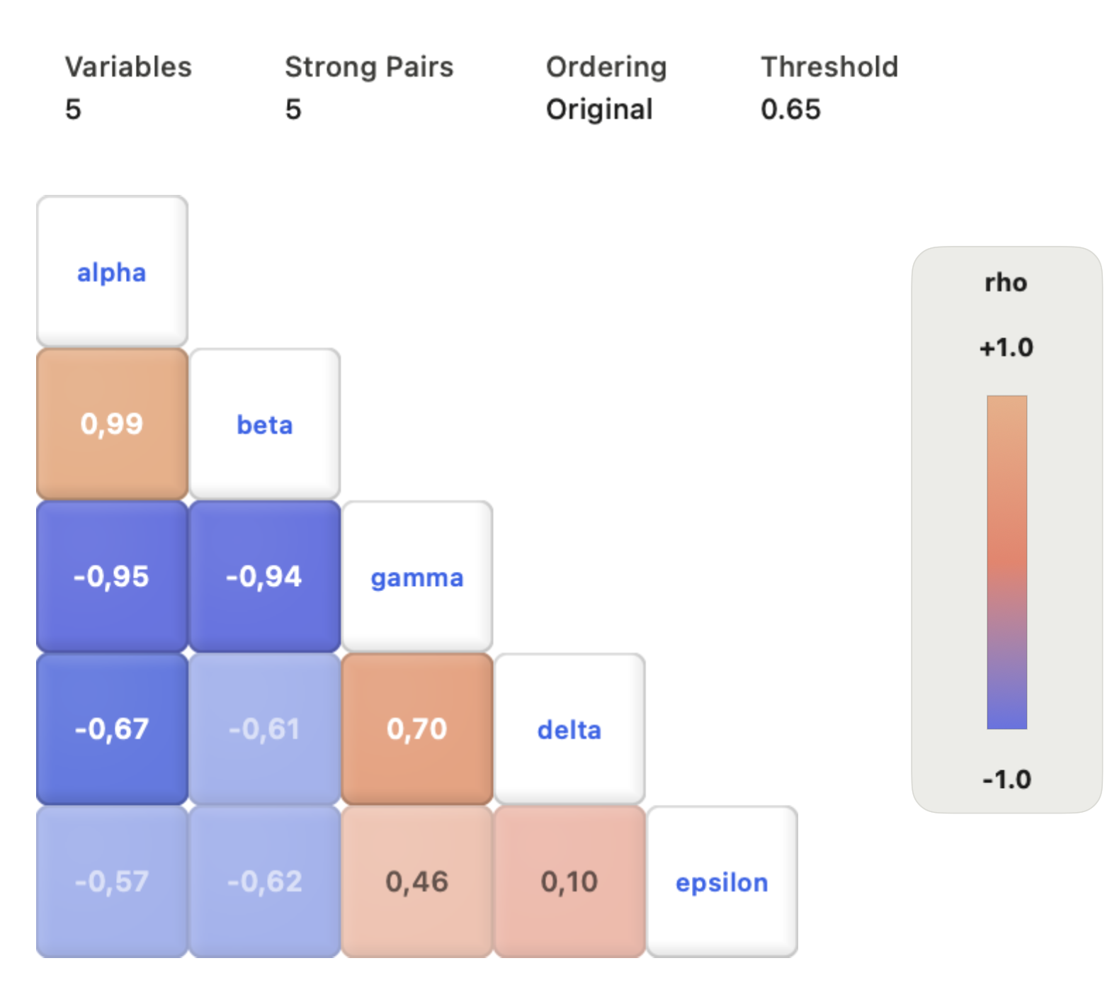
Each row and column is a variable; the cell where they meet holds their correlation coefficient. Cell (A, B) equals cell (B, A), so one triangle carries all the information.
| What you see | What it means | What it does not mean |
|---|---|---|
| Deep warm or cool cell | A strong positive or negative linear association | That one variable causes the other |
| Pale cell near zero | No linear association in these rows | No relationship at all; curves and groups can hide here |
| Block of strong cells | A group of variables that move together | That they measure the same thing |
| Same value in two cells | Equal linear association | Equal sample support, if missing values differ |
A useful habit: before looking at the colours, read the variable list and the sample size. A matrix of 30 variables has 435 distinct pairs, and some will look strong by chance.
What a Pearson correlation matrix measures
Pearson's r runs from −1 to +1 and measures how closely paired values follow a straight line. It is the default in most tools, and it has three well-known blind spots:
- Nonlinearity. A strong U-shaped relationship can give r near zero. A monotonic but curved one gives a value below its real strength.
- Outliers. One extreme point can create or destroy a strong r in a small sample.
- Mixed groups. Two clusters with no internal correlation can produce a high r between them, and the reverse.
Anscombe's quartet makes the point: four datasets with the same r and very different scatter plots. Spearman's rank correlation is more robust for monotonic relationships and outliers; Kendall's tau suits small samples with ties. Neither replaces looking at the data.
Before you compute: alignment, missing and infinite values
Correlation compares row 10 of one variable with row 10 of another. If a column was sorted independently or shifted by one sample, the coefficient is meaningless however clean the heatmap looks.
Missing values need an explicit rule:
- Pairwise deletion uses every row where both variables of a pair are present. It keeps more data, but each cell can rest on a different set of rows and a different n.
- Complete-case deletion drops any row with a missing value in any selected variable. Every cell then uses the same rows, at the cost of sample size.
Clean infinite values before computing. Many implementations skip NaN but not ±∞, which turns the sums behind r into nonsense. Constant columns have no defined correlation; depending on the tool they appear as blank, NaN or 0, so check any zero against the data before reading it as "no association".
Clustered ordering and highlight thresholds
Reordering the variables can make blocks of related measurements visible. Clustered orderings usually group variables by the absolute value of r, using a distance such as 1 − |r|. Strong negative and strong positive relationships therefore end up side by side: neighbours in a clustered matrix are related, not necessarily in the same direction.
A highlight threshold, such as |r| ≥ 0.6, changes which cells draw attention. It does not remove weak coefficients, recompute anything or test significance. Report the threshold when it shapes the figure, and keep the signed values visible.
From screening to inference
Once the matrix has pointed to a pair, plot it. A scatter plot shows curvature, clusters, outliers, uneven spread and acquisition-order effects that the coefficient cannot; the CSV plotting guide covers building one cleanly. If the plot leads you to transform or exclude data, recompute the matrix and note the change. In a paper, the matrix and the two or three scatter plots that matter often work best together as one multi-panel figure.
A claim about a correlation needs more than the cell value:
- Uncertainty: a confidence interval for r, which is wide for small n.
- A test, if you need one: a p-value for the null of zero correlation, computed with the n that cell actually used.
- Multiple comparisons: with k variables there are k(k − 1)/2 tests; correct with Holm or a false-discovery-rate method.
- Confounding: a partial correlation, or a model with covariates, when a third variable may drive both.
For data on a spatial or parameter grid rather than pairs of variables, a scientific heat map is the right figure.
Correlation matrices in Autoplot
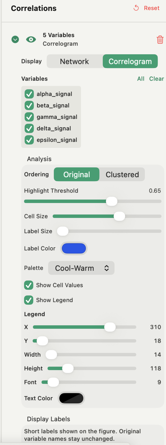
In a Correlations figure, Add Plot → Correlation View builds a Pearson matrix from two or more numeric variables. Display switches between a correlogram and a network, where variables are nodes and pairs above the Edge Threshold are edges. Ordering is Original or Clustered (average linkage on 1 − |r|, so strong negative and positive pairs sit together). The Highlight Threshold runs from 0 to 1 and changes emphasis only. A new view starts with Clustered ordering, a 0.55 threshold and the Balanced diverging palette centred on zero; Cool-Warm, Viridis, Magma, Plasma and Inferno are also available, and display labels shorten long names without renaming variables.
Practical points: rows are paired by position, NaN pairs are removed pairwise, so cells can use different n. Clean infinite values before building the matrix, because they are not filtered here. A pair with fewer than two valid rows, or a constant variable, is shown as 0 rather than blank, so check any zero against the data. The diagonal is 1.
The view computes Pearson only, and the matrix is a figure, not a saved variable. For Spearman, confidence intervals, p-values or multiple-testing corrections, ask the assistant: it writes the SciPy or statsmodels code, runs it on your Mac and keeps the script. Correlation views are part of Plus; see the features page.
Frequently asked questions
| What counts as a strong correlation? | There is no universal cut-off. Judge |r| against the field, the sample size and the scatter plot; an r of 0.5 can be important in one discipline and trivial in another. |
|---|---|
| Should I use Pearson or Spearman correlation? | Pearson for roughly linear relationships without strong outliers; Spearman when the relationship is monotonic but curved, or when outliers or ranks matter. Plot the pair to decide. |
| Why is the diagonal of a correlation matrix always 1? | Each diagonal cell is a variable correlated with itself, which is a perfect linear relationship by definition. |
Sources
Autoplot behaviour comes from the app's documentation for Correlations figures and the correlation algorithm, checked on 9 October 2026, and from the features page. NIST's handbook pages on the scatter plot and the scatter plot matrix support returning from coefficients to observations. Anscombe, Graphs in statistical analysis, introduced the quartet. SciPy documents pearsonr and spearmanr, and statsmodels documents multiple-testing corrections.