
On this page
Quick path: CSV to graph in six steps
- Open the CSV, TSV or other delimited text file in a tool that shows a preview of the parsed table.
- Set the delimiter, header row and number of rows to skip until every field sits in its own column and the first real observation is still present.
- Rename columns for the quantity and unit they hold, and decide what an empty cell,
NAand zero each mean. - Plot the independent variable on X and the response on Y; add further series only if they share units and X definition.
- Check range, gaps, outliers, scale and error values on the plot itself.
- Save the project or script with the source file, then export at the final size.
The rest of this guide explains what to check at each step and why.
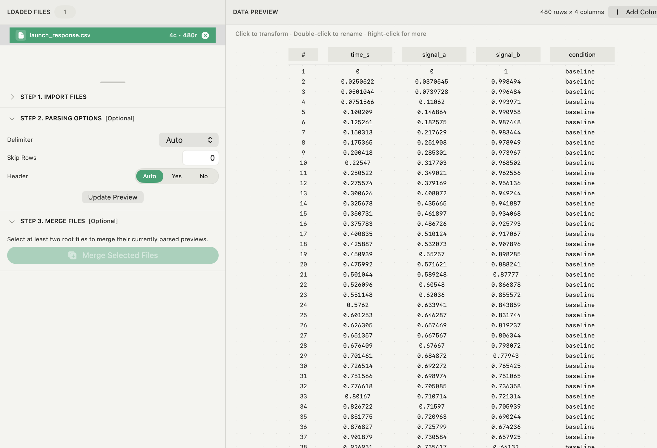
Check the CSV import preview first
CSV is a loose convention, not one format. Files differ in delimiter (comma, semicolon, tab, space), decimal separator, quoting, preamble lines from instruments, and whether the first line is a header. A file renamed to .csv keeps its original structure.
In the preview, confirm that:
- each expected field occupies exactly one column, and the column count matches what the instrument wrote;
- the header is a header, not the first observation, and no units row became data;
- decimal values are numeric, not text, and no thousands separators split a number;
- comment or metadata lines at the top are skipped, and the first real observation is still there;
- the row count matches the file, so nothing was silently dropped.
Keep one row per observation and one column per variable where you can. Units belong in the column name, not in numeric cells.
Name variables, then choose X and Y
A plot inherits its labels, legend and provenance from the column names. Rename before you plot: pressure_kPa saves a later edit in every figure and makes the exported data readable by someone else.
Put the controlled or independent quantity on X and the measured response on Y. Many tools, Autoplot included, fall back to row index when X is left empty. That is useful for a quick look at a sequence, but it assumes evenly spaced, correctly ordered samples, which instrument logs often are not.
For several related CSV files, the same rules apply per file before anything is combined. The guide to plotting multiple CSV files covers merging and comparing runs.
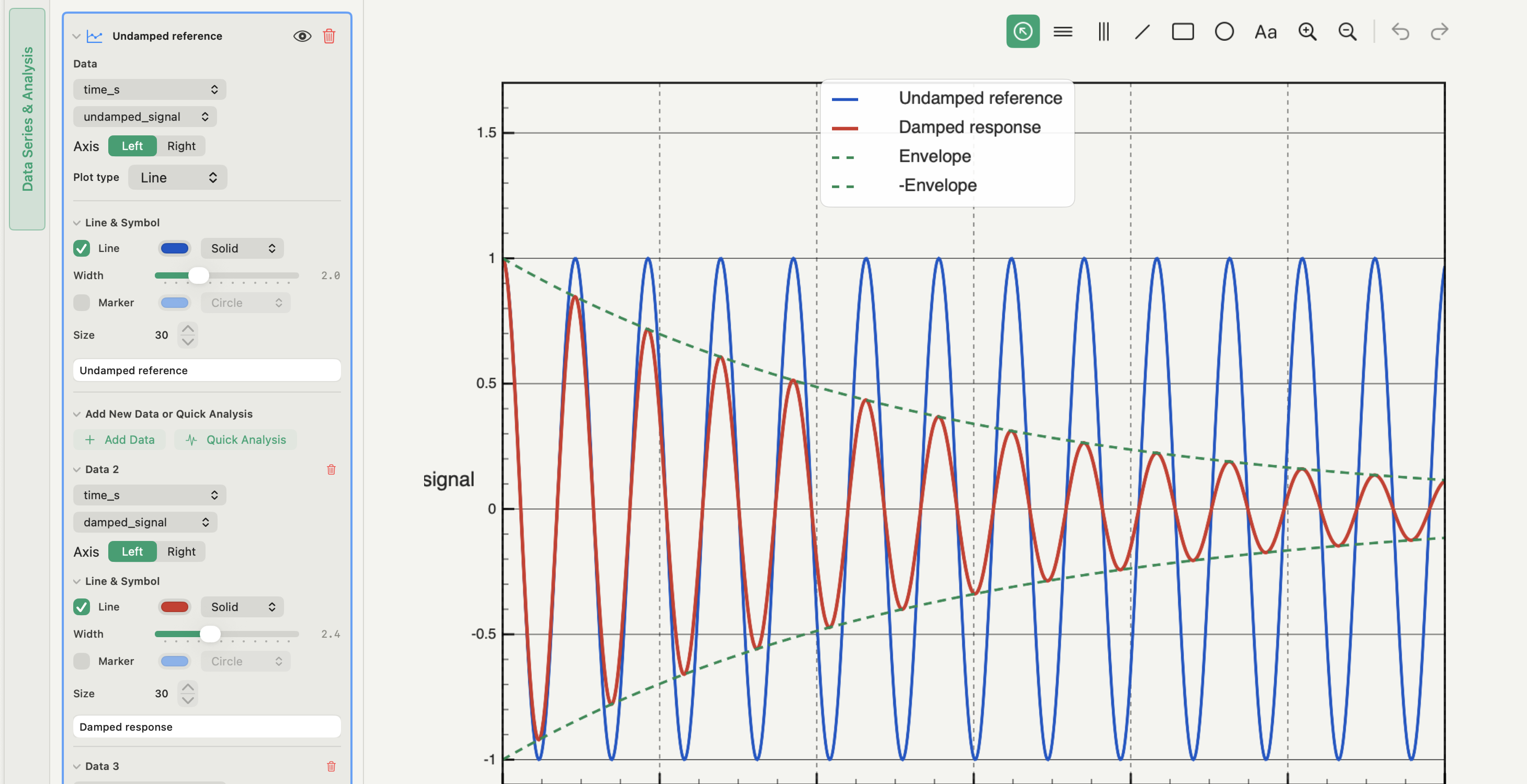
Inspect the graph before you interpret it
Start with the points, not a fitted line. Read the full range before zooming, and look for gaps, repeated X values, isolated spikes and values that are exactly zero where a measurement should be.
- Scale: use a logarithmic axis when the data span orders of magnitude or the model is multiplicative, not to make a curve look straighter. Non-positive values cannot appear on a log axis, so check what was dropped.
- Error bars: add them only when you know whether they show a standard deviation, a standard error or an instrument tolerance, and say which in the caption.
- Overlays: compare series only when units and X definitions match; otherwise split them into panels.
- Trends and smoothing: a running average or polynomial trend is a visual summary. Record the window or degree, and move to a proper fit when the parameters matter.
For a model fitted to the data, the guide on how to fit a curve to data covers residuals and sensitivity checks.
Export the CSV graph for its destination
Choose the export from where the figure will end up:
| Destination | Format | What to set |
|---|---|---|
| Journal or thesis line art | Vector PDF | Final width in mm or inches; fonts embedded |
| Slides, web, documents | PNG | Final pixel size, or physical size with 300 DPI |
| Print with fine raster detail | PNG at 600 DPI | Physical size first, then DPI |
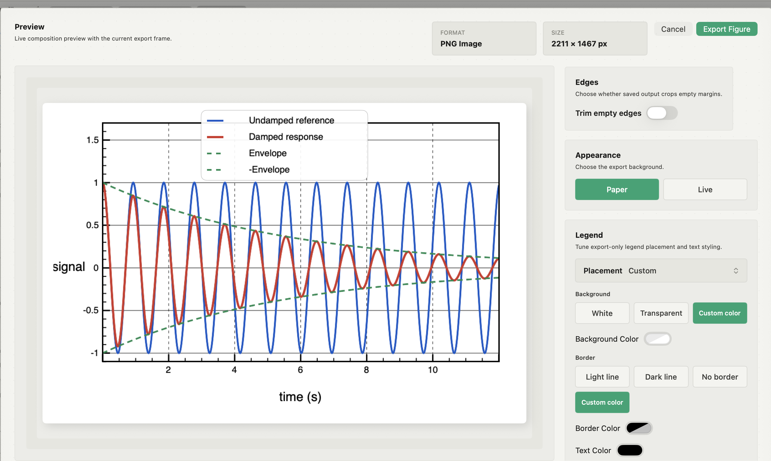
Set the physical size first and the resolution second. Enlarging a small raster later blurs text and lines. Check labels, legend and line weights at the size the reader will see, and open the saved file rather than trusting the preview. The guide to exporting a vector PDF figure covers what stays vector, and making a multi-panel figure covers arranging several plots on one page.
Other ways to graph CSV data on a Mac
Numbers and Excel open a clean CSV and draw a chart in a few clicks. They are fine for a quick look, but they hide parser decisions, guess at data types and make it hard to see exactly which rows were plotted. Python with pandas and Matplotlib gives full control and a script you can rerun, at the cost of writing and maintaining code. A dedicated plotting app sits between the two: visible parser settings, named variables and repeatable figures without a notebook.
Whichever you choose, keep the source file, the parser settings and the figure together, so a reviewer's question can be answered by changing the analysis rather than editing an image.
Plotting a CSV in Autoplot
In Autoplot, open the file from Import & Assign (Browse Files, a drop onto the window, Paste Table or an SFTP server). The parse bar holds Delimiter (Auto, comma, tab, space or semicolon), Skip rows and Header (Auto, Yes or No); Update Preview reparses the file, and each column header shows its type, range and valid count. Lines starting with #, % or // are treated as comments. Double-click a header to rename it, then click Create Variables.
In Analyze & Plot, an X&Y figure takes the variables you named. Plot types include line, step, bars, stem, lollipop, area and ribbon, with a right-hand axis, error bars, running averages, smoothing and linear or polynomial trends as overlays. Export writes PNG, JPEG or vector PDF at a size in mm, inches or pixels, with 300, 600 or custom DPI. Import and X&Y plotting are in the free plan.
The parser is built for delimited text. Igor, Origin and Jupyter files do not open directly; export the tables to CSV first. See the features page for the full list.
Frequently asked questions
| Why does my CSV open as a single column? | The delimiter is wrong. Files written with a comma as the decimal separator usually use semicolons between fields; set the delimiter explicitly and reparse. |
|---|---|
| Can I plot a CSV without a header row? | Yes. Tell the parser there is no header so the first line stays data, then name the generated columns before plotting. |
| Should I export a CSV graph as PDF or PNG? | Vector PDF for line plots going into a paper or thesis, because lines and text stay sharp at any zoom. PNG at the final pixel size for slides and web pages. |
Sources
Autoplot behaviour comes from the app's documentation for import and source files, import preview column editing, variables, X&Y plots and the export dialog, checked on 9 October 2026, and from the features page. RFC 4180 describes the common CSV format and its variations. The pandas read_csv reference lists the parser options a scripted workflow has to set explicitly.