On this page
When a 3D scatter plot is the right choice
A third spatial axis costs precision: readers cannot judge distances, slopes or exact values in a projected scene. It pays off only when the joint position is the point.
| Situation | Better choice |
|---|---|
| Spatial coordinates, such as particle positions or sensor locations | 3D scatter, with rotation |
| Two groups that separate only in three dimensions | 3D scatter, plus the 2D views that fail to separate them |
| A path through three variables, such as a trajectory or phase portrait | 3D line, keeping row order |
| A third variable that only labels groups or intensity | 2D scatter with colour or symbol |
| A dense cloud where density is the question | Heat map or 2D histogram |
| Exact comparison of values between groups | 2D scatter plots or small multiples |
If the third variable is a smooth function of the other two, a surface or a heat map shows it better than scattered points.
How to make a 3D scatter plot, step by step
- Check that x, y and z are numeric, in the intended units, and describe the same observations in the same row order. Rows with a missing or non-finite coordinate cannot be placed.
- Choose the scene type: points for a cloud, a line only when row order is a real path, a surface only when the data form a field.
- Assign the axes and label each with its quantity and unit.
- Set marker size and opacity for the density of the cloud; smaller, partly transparent markers reveal more of the interior.
- Rotate through several viewing angles and compare perspective with orthographic projection.
- Add stems or base-plane projections only where they clarify position.
- Make at least one 2D view of the same rows, then export the version that shows the claim most directly.
Occlusion and depth: reading points in 3D
In a projected scene, a point's screen position mixes all three coordinates. Two points that look adjacent may be far apart in depth, and a dense front layer can hide everything behind it. Common depth cues help, each with a cost:
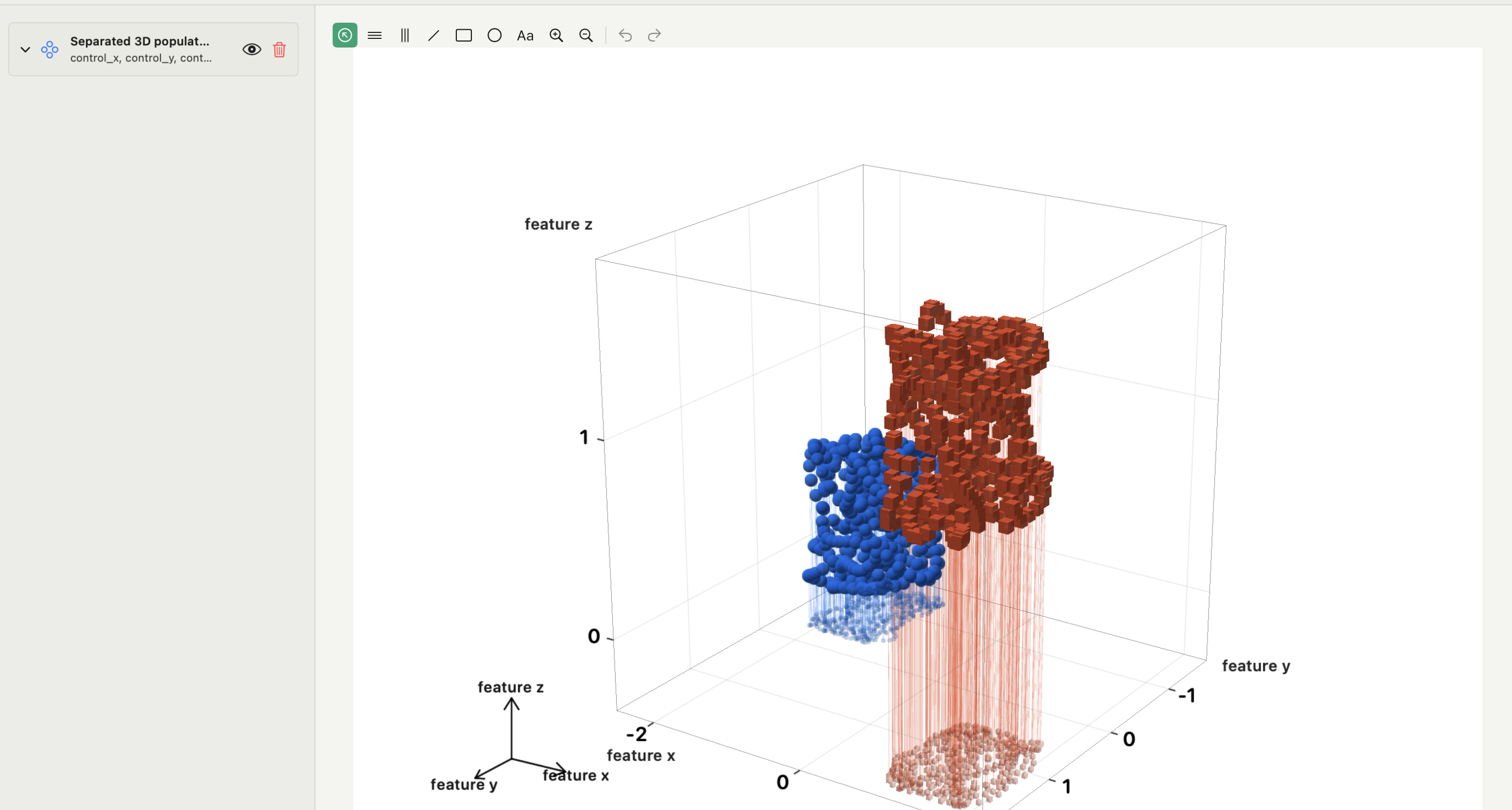
- Base-plane projections (shadows or footprints) show the x–y position of every point, but double the ink.
- Stems connect points to the floor and make height readable, but become a thicket in dense clouds.
- Colour by z repeats the height in a second channel, at the expense of using colour for groups.
- Opacity and smaller markers reduce occlusion, but faint points are easy to miss in print.
- Rotation is the strongest cue of all, and it is lost the moment the figure becomes a static PDF.
For a printed figure, assume the reader sees one angle only. Choose it so the claim is visible without motion, and show a second angle or a 2D view when one is not enough.
Camera angle and projection
The camera is usually set by azimuth (rotation around the vertical axis) and elevation or tilt (how far above the floor you look from). Before choosing a view, step through several: if a gap between groups closes, or an apparent line becomes a blob, the structure depends on the viewpoint.
Perspective projection makes distant points smaller, which feels natural and gives a sense of depth, but distorts size and distance comparisons across the scene. Orthographic projection keeps scale constant with depth, so parallel lines stay parallel and sizes can be compared, at the cost of a flatter look. Neither removes occlusion. Record the angles and projection with the figure so the view can be reproduced.
Dense point clouds and decimation
Interactive 3D views often cap the number of points drawn to stay responsive. How the subset is chosen matters:
- A deterministic stride, such as every tenth row, is reproducible but follows the file order. If the rows are sorted by time or group, the subset can be biased.
- Random sampling is unbiased on average but changes between runs unless seeded.
- Aggregation into bins shows density honestly but no longer shows individual points.
State in the methods when a figure shows a subset, and how it was taken. If density is what the reader should see, a heat map or joint-density map is the more honest figure.
3D scatter plot alternatives
Often the clearest figure is not 3D at all:
- Pairwise 2D scatter plots (x–y, x–z, y–z), side by side or as a scatter plot matrix. Exact positions, no camera.
- A 2D scatter with colour or size for the third variable, when that variable is continuous and its scale is clear.
- Small multiples that slice the third variable into ranges, one panel per slice.
- A heat map of z over x and y when the third variable is a measured value rather than a coordinate.
A common pattern is to explore in 3D and publish the 2D projections, with the 3D scene in the supplement. The multi-panel figure guide covers combining the views on one page, and the correlation matrix guide helps choose which variable pairs to plot when there are many.
Making a 3D scatter plot in Autoplot
In a 3D figure, Add Plot → Scatter creates a point cloud; Surface and Line create a height surface and an ordered trajectory. Select X, Y and Z in the scene's Source section; rows are paired by position, and rows with a non-finite coordinate are not drawn. Additional point series can be overlaid with their own styling: sphere, cube, cone or cylinder symbols, opacity and size.
Camera sets Azimuth, Tilt and Zoom, with presets (Isometric, Top, Bottom, Front, Back, Left, Right) and Reset Camera. Projection is Perspective or Orthographic. Project to Base draws each point's footprint on the base plane, and Stems to Base draws vertical stems. Max Points decimates dense clouds with a deterministic stride rather than random sampling, so record the value you used. A Line scene keeps row order, so sort the table by time or path coordinate first.
3D scenes can be exported and placed on a Compose board like any other figure. Run Analysis is not available in 3D figures; for a fitted surface, fit it on a heat map and use the exported function as the scene's Z. 3D plots are part of Plus; see the features page.
Frequently asked questions
| How do I make a 3D scatter plot in Python? | With Matplotlib, create axes with projection="3d" and call scatter(x, y, z). Set the view with view_init, and choose orthographic projection with set_proj_type("ortho") when sizes must be comparable. |
|---|---|
| Are 3D scatter plots good for publications? | Sometimes. They work when the three-dimensional arrangement is the finding and one angle shows it. Otherwise, pairwise 2D plots or small multiples are easier to read and to check. |
Sources
Autoplot behaviour comes from the app's documentation for 3D figures, checked on 9 October 2026, and from the features page. Matplotlib's 3D plotting gallery and mplot3d API describe 3D axes as a 2D projection of a scene, including view angles and projection type. Claus Wilke's Fundamentals of Data Visualization discusses when 3D helps and when it misleads.