
On this page
Plotly Studio vs Autoplot: the deliverable decides
| Need | Plotly Studio | Autoplot |
|---|---|---|
| Interactive dashboard or Dash app | Yes, the core purpose | No; exports static files |
| Live connection to a database or warehouse | Yes | No; imports delimited tables |
| Generated Python and SQL for every step | Yes | Python for assistant steps and supported exports |
| Fixed figure at journal size, vector PDF | Not the focus | Yes, with embedded fonts and DPI presets |
| Multi-panel figure on a paper-sized board | Not the focus | Compose |
| Share a live result with a team in the browser | Plotly Cloud or Dash Enterprise | No; share files or the project |
| Operating systems | macOS and Windows desktop app | macOS only |
Neither column is a verdict on quality. They are different products for different outputs. For the wider field of native apps, Windows-only tools and code, see scientific plotting software for Mac.
Where Plotly Studio leads
Plotly describes Studio as working like an analyst in an agentic loop. It connects to data, explores it, writes Python and SQL with Plotly, Dash and pandas, and keeps the code behind each step so it can be checked and re-run. It can reach what Python can reach: warehouses such as Snowflake, Databricks and BigQuery, databases such as Postgres and MySQL, and CSV files.
Its output is interactive. Studio builds Dash apps connected to live data and publishes them with one click to Plotly Cloud or Dash Enterprise, where colleagues can open them in a browser. When readers need filters, linked views or data that updates, that is the stronger deliverable, and a fixed figure is the wrong substitute.
If the team already writes Python, Plotly's graphing library is a third option: code-first, without the agent.
Where Autoplot is the better fit for scientific figures
A paper figure has different requirements from a dashboard: an exact size, a font that survives the journal's pipeline, panel labels, and a method the reader can name.
- The import is inspectable. A parser preview shows delimiter, header row and skipped rows before anything is plotted.
- Methods are fixed and named. Analysis cards run tested Python implementations locally and write results back as variables, rather than code generated afresh for each request.
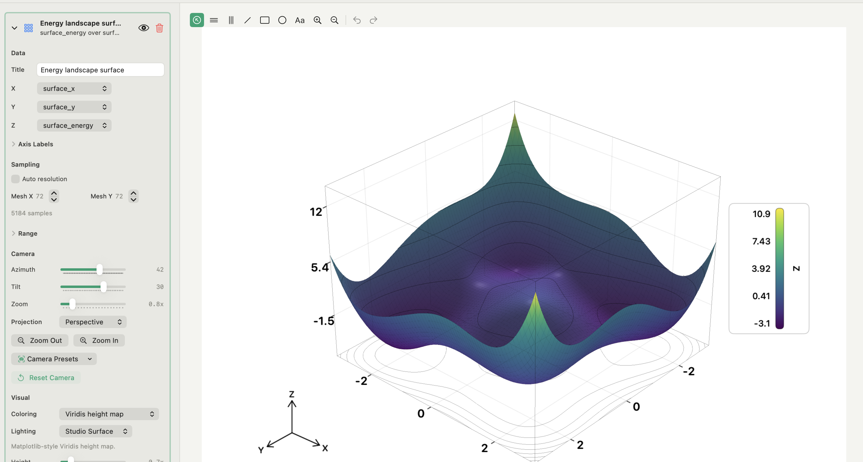
- 2D and 3D share one project. X&Y plots, histograms, heat maps, 3D surfaces and scatter use the same variables.
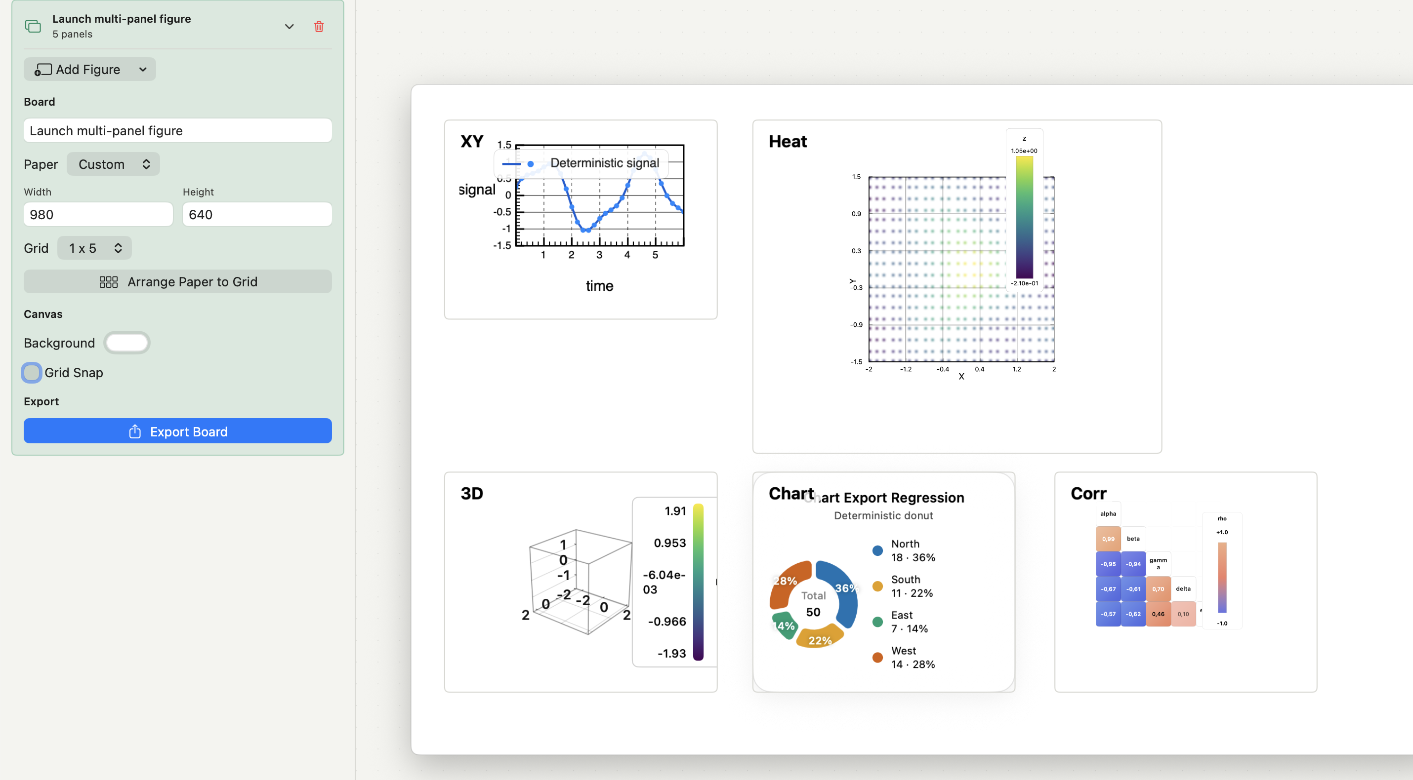
- Composition is part of the workflow. Compose places finished plots on A4, Letter or custom boards, with panel labels and grid snapping.
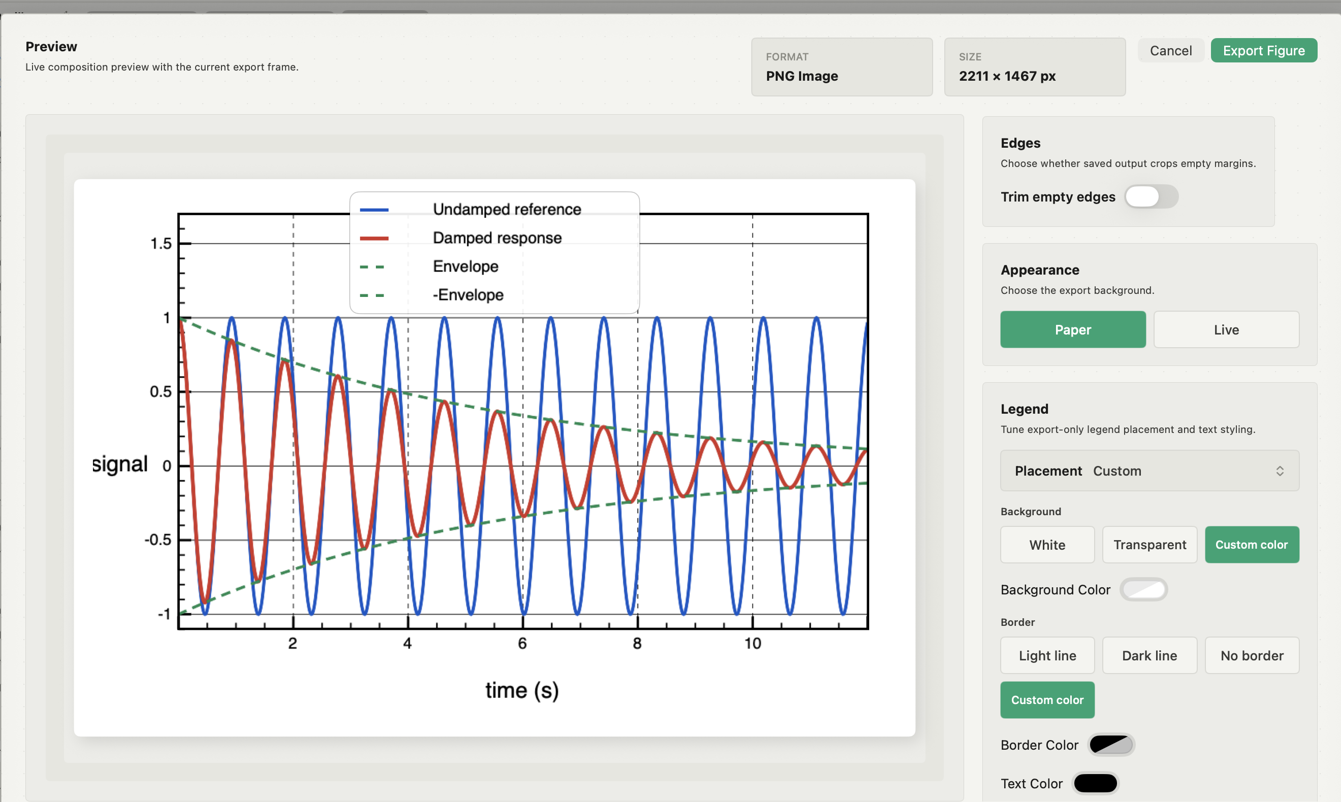
- Export is controlled. PNG, JPEG or vector PDF with embedded fonts, journal presets and DPI.
The multi-panel figure guide shows that workflow step by step.
How each product handles your data and the AI
Plotly says Studio's desktop app runs all code locally and keeps credentials in the operating system's keychain, while prompts, metadata and output previews pass through the language model. Data and code stay local until you publish. On Dash Enterprise, Studio uses a private AI proxy set up by the administrator.
In Autoplot, import, analysis, plotting and export run locally without the assistant. The assistant is optional. When you use it, it writes Python, shows it to you before it runs and runs it on your Mac inside a working folder; with cloud models, only your request and column names leave the Mac, never the values.
For sensitive data, read both vendors' current documentation and your own deployment settings. A desktop window on its own says nothing about where data goes.
Evaluate both on one dataset
- Import the same representative dataset into both and verify schema and units.
- Recreate the calculation the real result depends on, and compare the numbers.
- Build the view you actually need, not a convenient substitute.
- Make the revision you expect: a new range, series, model, annotation or layout.
- Produce the real deliverable, a PDF figure or a published app, and record what left your machine on the way.
If the group needs both outputs, use both: maintain the interactive app in the Plotly stack and make the paper figures in a figure workspace. For revising figures that currently come out of a notebook, see the Jupyter alternative guide.
What Autoplot does, and where Plotly Studio is better
Autoplot is a native Mac application for importing delimited tables, analysing them with fixed methods, plotting in 2D and 3D, composing multi-panel figures and exporting PNG, JPEG or vector PDF. For anything not built in, the assistant writes Python that runs on your Mac and keeps the script, and supported figures export as editable Matplotlib scripts.
It does not build dashboards or web apps, connect to databases or warehouses, publish to the browser, or run on Windows. When those are the job, Plotly Studio is the better choice. Heat maps, 3D plots and Compose are part of Plus; see the features page and pricing.
Frequently asked questions
| Can Autoplot make interactive dashboards? | No. It produces fixed figures as PNG, JPEG or vector PDF, and Matplotlib scripts for supported figures. For dashboards and data apps, use Plotly Studio or Dash. |
|---|---|
| Are Plotly Studio, Plotly.py and Dash the same thing? | No. Plotly.py is the Python graphing library, Dash is the framework for data apps, and Studio is the AI-native tool that writes code with both and assembles apps. |
Sources
Plotly Studio's scope, data connections, local code execution, model data flow and publishing paths come from Plotly's Studio product page, the Studio documentation and the Studio announcement, checked on 9 October 2026. Plotly.py's role comes from the Plotly Python documentation. Autoplot statements come from the app's documentation for import, analysis cards, Compose, export and the assistant, checked on 9 October 2026, and from the features page.